This is the second part of the tutorial focuses on adding tables and charts and will complete the second half of the sample report. The first part of the tutorial can be found here.
Data Table
Add a data table
Select the Data Table (not Time Series Table) widget from the toolbox and drag it below the three text boxes that were created in the previous tutorial.

The widget displays demo data by default. To change the data right click on the widget and select Properties (or simply double click on the widget). Tables and charts have an additional ‘Data’ tab that lets you select indicators from the data catalog.
Switch to the ‘Data’ tab.
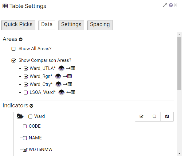
The tab is split into ‘Areas’ and ‘Indicators’.
‘Areas‘ is used to add comparison values from other geographies (e.g. LSOAs) to the report. Ignore this option for now but make sure to untick the ‘Show Comparison Areas?’ box.
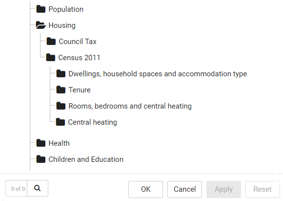
‘Indicators‘ displays data that is available for the selected geography (Wards). The first folder holds data that comes from the underlying feature service. In most cases this can be ignored and these indicators be deselected. All other folders are themes that hold indicators from the data catalog. Click on the names or folder icons to expand or close themes. You can also use the search box to search the data catalog for specific terms.
All indicators with a ticked box are selected and will be displayed in the widget. You can either untick each of the selected indicators or use the help bar to deselect all indicators at once (center button).
![]() Tip: It is good practice to always deselect all indicators before picking the actual data for a chart. This will prevent any previous selection in the data catalog from being carried over. Make sure to not close the properties before having decided on which indicator to use, as you need at least one active indicator for a widget.
Tip: It is good practice to always deselect all indicators before picking the actual data for a chart. This will prevent any previous selection in the data catalog from being carried over. Make sure to not close the properties before having decided on which indicator to use, as you need at least one active indicator for a widget.
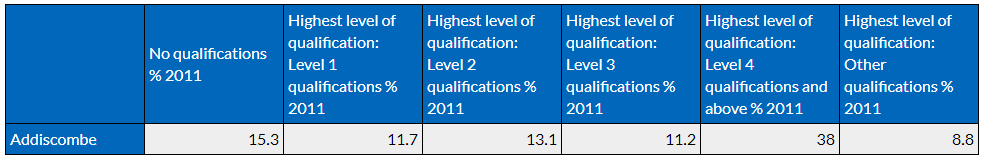
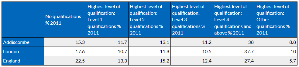
Locate the ‘Children and Education’ Theme and expand ‘Census 2011 / Qualifications and students’. Make sure that no other indicator is selected and then tick the boxes for these indicators:
- No qualifications %
- Highest level of qualification: Level 1 qualifications %
- Highest level of qualification: Level 2 qualifications %
- Highest level of qualification: Level 3 qualifications %
- Highest level of qualification: Level 4 qualifications %
- Other qualifications %
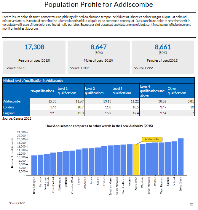
After applying the changes, the table should now look like this:
Add comparison data from the data catalog
Comparison data are values from a different geography, e.g. all LSOAs that form the ward or the national value for the whole of the country. Displaying such values in widgets will add context to your charts will help the end user to better understand the information.
The specific options in the ‘Area’ section of ‘Data’ will depend on the geography you are working with. You can choose which comparison values to be use by selecting the appropriate boxes. Make sure that the ‘Show Comparison Areas?’ box is also ticked. The option ‘Show All Areas’ will add all areas of the same hierarchy (if they exist in the data) to your report, e.g. all other wards.
Make sure that this option is deselected and tick the box for ‘Show Comparison Areas?’.
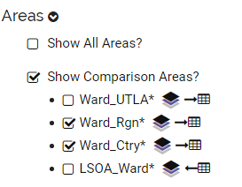
Select Ward_Rgn* and Ward_Ctry* – this will add Region and Country as comparison areas. After applying your selection, your table should now look like this:
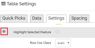
Further adjust the table with ‘Settings’
While ‘Quick Picks’ are a good starting point for a design or can be used to compare layouts quickly, the ‘Settings’ give full control over the layout and behavior of a widget. To get more information on a specific setting, click on the help icon that shows up when you hover over a property:
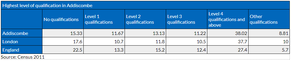
In ‘Table Cell Style’ you can change the design of your table. The example report uses a blue color as ‘Header Cell Background Colour’. Click on the white box to define a color in the color picker.
The content of the table can also be simplified:
First, go into the ‘Labels, Text & Titles’ group. Select ‘ShortName’ for ‘Label Style’ to shorten the indicator name and make the header cells more readable. Delete #DATE from ‘Indicator Label Text’ as this information is redundant – all data is coming from Census 2011.
Then scroll down and put ‘Source: Census 2011’ into the Table Footer to indicate the source of your data. Lastly, put ‘Highest level of qualification’ into the ‘Table Header box to add a title row.
![]() Tip: As with text widgets, you can also add substitution variables to some of the table or chart properties. To add the name of the selected area to the table header, click on the gray pen icon next to the box and select ‘Feature Name’.
Tip: As with text widgets, you can also add substitution variables to some of the table or chart properties. To add the name of the selected area to the table header, click on the gray pen icon next to the box and select ‘Feature Name’.
The result should look like this:
Bar Chart
Add a bar chart
Adding charts to the report is similar to adding tables. Select the bar chart widget from the toolbox and drag it into the report. It should be placed beneath the table, be half of the page size and anchored to the left. Right click on the widget to apply these settings.
After placing the widget, bring up the properties. Go into the data tab and select Ward_Rgn* and Ward_Ctry* as comparison areas. Make sure that the ‘Show Comparison Areas?’ box is ticked. Then, scroll down to indicators, deselect all indicators and locate the ‘Population / Estimates / Other Groupings / All’ theme. Select these indicators:
- Persons age group 0 – 17%
- Persons age group 18 – 64%
- Persons age group 65+%
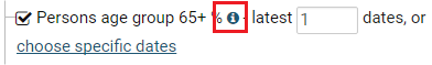
Do not change any date settings so that the latest date is selected by default. You can click on the metadata link to display source information and e.g. the publishing date if needed.
Click apply and close the settings.
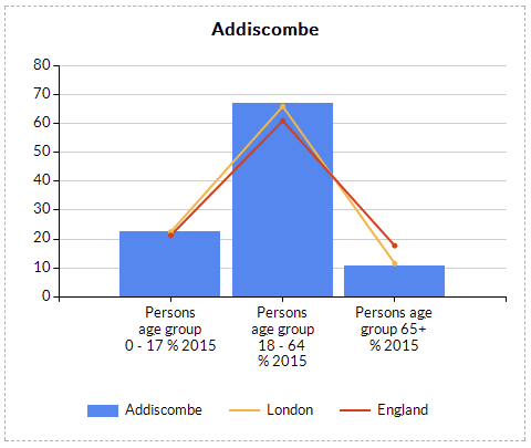
In the default bar chart indicators are displayed as bars, while comparison data is displayed as lines.
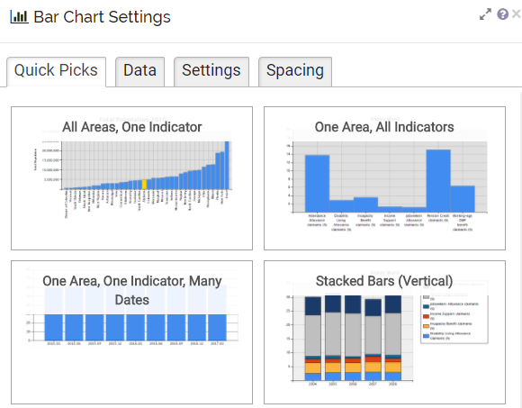
Change the layout with Quick Picks
You will have noticed that the bar chart created in the last section is different from the bar chart in the sample report. While there is only one bar chart widget in the toolbox, different chart types can either be build with the help of ‘Quick Picks’ or by adjusting the settings manually.
To transform the bar chart to the one featured in the sample report, open the properties and go to the ‘Data’ tab. Deselect all indicators and comparison areas, then select ‘Person all ages’ from ‘Population / Estimates’ as the single indicator for this chart.
Now switch to the ‘Quick Picks’ tab and select ‘All Areas, One Indicator’.
The bar chart should now look like the one from the sample report – it displays all wards in your geography, ordered by value, and highlights the currently selected ward.
To further improve the chart, go back into the settings. Under ‘Borders, Colours and Styles’ you can change the highlight color. If you change the setting ‘Highlight Style’ from ‘Fill’ to ‘FillAndCallout’, a small callout box with the name of the currently selected area is added.
Some areas have a large number of wards, so the X-Axis might become difficult to read. If this is the case, you can disable ‘Force One Axis Label Per Bar‘ (Bars) so that only some areas are labelled. The callout will help to identify the area you are looking at.
Congratulations! Your report should now look like the sample report. If you have further questions or need any help, please make sure to contact support@instantatlas.com.