Different settings are available from the Styling > Views menu in the Report Builder editor page.
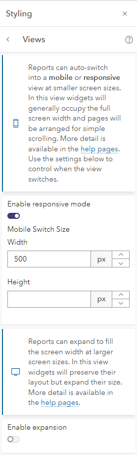
Report Builder can create reports that are responsive – that react to the device they are being viewed on (a laptop, a tablet, a mobile phone) and change the layout of the report automatically. This ability is enabled by default but you can turn it off or customize how it behaves from the Styling > Mobile View menu item when you are editing your report.
When Enable Responsive Mode is turned on, reports will adjust their layout at three different points:
- 75% of original width – at this point the report will switch from its target width down to 100% of the available width and all content will “re-flow” to adjust to this new width. This avoids the viewer having to scroll horizontally on small screens.
- 66% of original width – at this point the report will force all widgets to appear in a linear flow (i.e. one underneath the other, not alongside) but will not adjust their sizes.
- “Mobile Switch Size” – (a value configured by the report designer or 500px width by default) – at this point all widgets are set to occupy 100% of the available width and all text-based widgets will automatically expand down to show all their content. If you want the report to always re-flow whenever the screen is smaller than you designed/desired page size, set this value to 1 pixel less than your page size.
Mobile Switch Size allows you to use both width and height to control when your report switches view. In normal circumstances you should only use width, since most viewers of your report will expect and be used to scrolling up and down to access content rather than left to right. Only use height if you are targeting a very specific viewer (see Styling > Advanced below).
Some widgets have more specialized responses to screen size changes – for example, most of the Infographic widgets will attempt to re-flow their content so that all the icons are visible on-screen.
You can use your browser’s emulation options to replicate different mobile devices.
The automatic responsive design features in Report Builder do have limits – making web pages react to every possible viewing device can be very complex. If you have a specific behavior or style that you need that is not provided by the built-in functionality remember that you can use the Styling > Advanced menu item to override any CSS you want, including @media queries – but be careful!
The Enable expansion option can be used to make a report expand to fill the screen width at larger screen sizes. In this view widgets will preserve their layout but expand their size.