When websites and web tools are properly designed and coded, people with disabilities can use them. However, currently many sites and tools are developed with accessibility barriers that make them difficult or impossible for some people to use.
The quote above comes from the Web Accessibility Initiative’s (WAI) “Introduction to Web Accessibility” page. Report Builder 2.0 has been designed with accessibility in mind and makes use of a number of technologies and techniques to try and ensure that the reports it builds have as few accessibility barriers as possible. The most important features are described below, along with some tips to help you when authoring/designing your own reports (marked with a ℹ️ icon).
Web accessibility is a huge topic with many linked and overlapping problems, techniques and solutions. This article should be seen as an introduction to accessibility in Report Builder and is not a standalone document – a familiarity with at least some of the Accessibility Fundamentals outlined by the WAI is assumed. If you have a specific accessibility concern not detailed here please contact contact the Esri UK Technical Support helpdesk (UK and Ireland customers only). International customers please email internationalsupport@esriuk.com.
Web Content Accessibility Guidelines (WCAG)
Report Builder aims to achieve level AA conformance with version 2.1 of the Web Content Accessibility Guidelines (WCAG). Data-driven widgets like tables, charts and maps are all designed to meet these guidelines and use a variety of techniques to either adjust their appearance for different viewers or, where that is impossible, to provide alternative means of accessing the data (this is discussed in more detail below).
ℹ️ Note: not all reports will meet all success criteria or be AA compliant because the design of each report is ultimately controlled by the report’s author. Report Builder cannot guarantee, for example, that a report will not contain confusing language, poor color choices, charts with no labels or badly designed page “flow”. Report authors are encouraged to make themselves familiar with the WCAG Quick Reference documentation, especially section 1.4 Distinguishable and the Tips for Writing.
Page Structure and Semantic Elements
Reports built using Report Builder 2.0 all use HTML5 and make use of semantic HTML elements and landmarks to help screen readers or other assistive technologies. For example, everything that acts like a button is a <button>, a report is always an <article> and a page within a report is a <section>. A fuller discussion of these techniques is available on the accessibility pages of developer.mozilla.org and the W3C ARIA documentation.
ℹ️ You should also take care when designing reports and make correct use of headings within pages to help users make sense of the information in the report. For example, it is recommended that each page within a report contains an <h2> that summarizes the contents of the page. The WAI’s Tips for Writing page is a good place to start.
Note also that if you embed your reports inside another, custom, web page then the page structure will change slightly and you need to take care with the structure of the enclosing page – in particular making sure you use a <main> landmark to enclose the embedded report.
Keyboard Navigation
All links and buttons within the view report pages are keyboard accessible/navigable using standard browser mechanisms (e.g. Tab to Move, Enter to activate). As noted above, every element that performs an “action” will be a <button> or a link (<a>). If a button opens a dialog then that dialog will “trap” the focus so that keyboard navigation continues to work logically (i.e. within the dialog whilst it is shown, then back to the same point in the page where the focus was before the dialog was opened). Dialogs opened in this way can always be closed using the Esc key.
Buttons, Text & Labels
Where a button or link is visually presented as a single icon (for example the button that allows a user to export a chart as an image) then there will be text describing what the button does either hidden within the button (visually hidden but accessible to screen readers) or as an aria-label attribute on the button.
ℹ️ If you include links within a report you are authoring it is important to use them correctly to maintain accessibility. There are both technical and “common sense” approaches to authoring links (e.g. never using the words “click here” as the only content in your link). Report Builder allows you to access the raw HTML for text widgets if you need to to add labels etc. – see the help pages for text widgets and the WAI’s tips for writing links.
Tables
Report Builder has a number of widgets that use HTML <table>s. These have all been designed to meet accessibility guidelines and use a number of techniques to associate data cells with headers etc. More detail on some of the techniques used can be found in the tables page of the WAI tutorials site.
Report Builder does not use tables for purely layout purposes (e.g. aligning unrelated items on a page, sizing charts and captions).
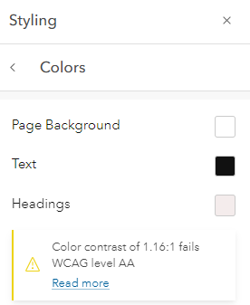
Colours
Report Builder has a built-in set of color palettes that allow you to quickly and easily change the text, border and background colors for all widgets in your report. These colors have been carefully chosen so that they meet the WCAG color contrast criteria. If choosing your own colors Report Builder will show a warning in this dialog when colors do not meet the relevant contrast criteria.
Charts
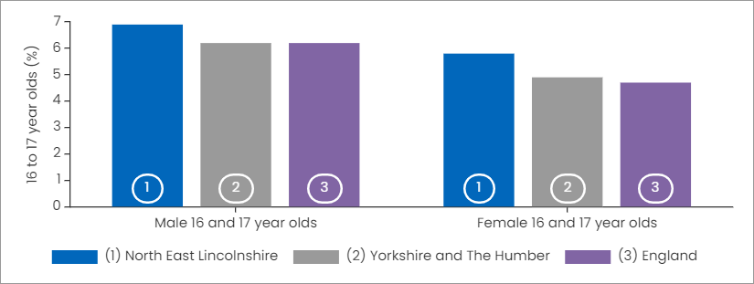
Charts can be problematic for some users – mainly because they often use color as the only or primary way of conveying information. This goes against many of the principles in the WCAG documentation. Report Builder has a number of mechanisms to address this which are discussed below. ℹ️ Page authors who want to use charts in their reports are encouraged to read the accessibility user stories on the WAI site.
Charts are drawn when the report is first loaded and re-drawn if the report’s viewport changes. This ensures that (as far as possible) charts are reactive to user actions such as zooming the browser window or changing the orientation of a mobile device. This ensures that the charts remain as clear as possible at all screen resolutions.
Chart Options: Labels & Styles
ℹ️ Charts in Report Builder have the ability to attach data labels to each item in the chart (for example to every bar in a bar chart). In many cases this can improve accessibility by giving an alternative way of identifying the data in the chart rather than solely color. This is an opt-in mechanism – the report author must choose to add data labels. This technique is not applicable to all charts and can in fact reduce accessibility if used incorrectly (for example by showing labels at a very small or very large font size in charts with many features) so it is not applied automatically.
(#INDEX) #NAME, data point labels to #INDEX and the values are auto-populated by Report Builder when the chart is drawn.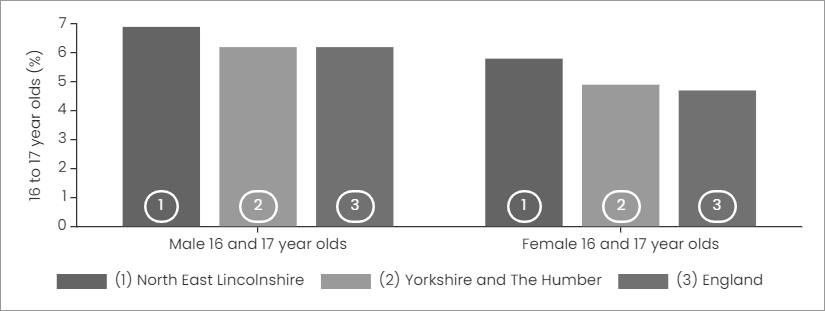
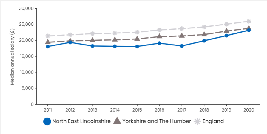
ℹ️ For line charts and radar charts the line style can be adjusted to use pattern and point/marker style as well as color to distinguish lines.
#POINTINDEX to generate the number values.These styling options are kept under constant review to see if we can improve them. For example, we are currently exploring the use of patterns for bar and pie charts to supplement color and labelling.
Alternative View: Interactive
Each chart widget has a Show Data Table button. If a user clicks on this the data used to draw the chart will be shown in a tabular format in a pop-up dialog. This provides an alternative (albeit less visually appealing) view of the data for users with a visual impairment.
ℹ️ Report authors are encouraged to consider placing tables alongside or underneath charts in their reports.
Alternative View: Automatic & Screen Readers
Each chart widget in Report Builder is rendered using an HTML <canvas> element. Canvases can be problematic for users with a visual impairment, particularly those who use screen readers. Report Builder automatically embeds a <table> containing the same data as the chart inside the <canvas> element. This table is invisible to users who access the report visually but provides an alternate (or fallback) view of the data. More information on this technique can be found in the canvas tutorial at mozilla.org.
Maps
Maps can suffer from the same accessibility problems as charts, most often the requirement “don’t use color alone to convey information“. Maps in Report Builder use ArcGIS Online web maps which have a number of different options to visualize and classify data – as with charts these are generally opt-in techniques since it is not practical to automatically add labels etc. to every map.
ℹ️ When using a map as a navigation tool (either to show the current feature’s location or to allow a user to navigate to a report for a different feature) report authors are encouraged to provide an alternate (duplicate) navigation mechanism, for example an “open map in new window” link or a navigator widget.
Page Zoom
Reports respond to the screen size in which they are viewed (responsive design). For charts this may mean adjusting their labels and axes to preserve clarity, for text widgets it may mean applying a reflow of the text within the widget. Reports have a relatively simple structure of report > page(s) > widget(s) which means that they can respond and lay themselves out at a variety of screen resolutions.
Report Builder has a number of built-in breakpoints when the screen is smaller than the report was originally designed for (e.g. on a mobile phone or tablet). At these points widgets may reflow more significantly and some widgets may hide less important information to present their data more clearly. You can read more about responsiveness in Report Builder on the responsive settings help page.
ℹ️ You should take care when designing reports with a lot of text, tables and images as these can break the reflow behavior if they are set to an explicit height, rather than auto-height (which is always available with one click in the editor user interface (UI)).
Web Accessibility Testing
There are evaluation tools that help with evaluation. However, no tool alone can determine if a site meets accessibility standards. Knowledgeable human evaluation is required to determine if a site is accessible.
From: https://www.w3.org/WAI/test-evaluate/
In developing Report Builder we have used a number of automated testing tools including the axe DevTools browser extension, Google Lighthouse and WAVE. We have also tried hard to follow all the relevant guidelines and best practice and have tested the pages using “real humans”. We are aware, however, that web accessibility is a huge and dynamic area and we are not accessibility experts – if you have a specific accessibility concern not detailed here please contact the Esri UK Technical Support helpdesk (UK and Ireland customers only). International customers please email internationalsupport@esriuk.com.
Please note that all of the above discussion relates to the viewing of reports built using Report Builder. The editing user interface (UI) used by report authors uses many of the same techniques but is not currently WCAG AA compliant, mainly because it cannot scale to all screen resolutions and requires the use of a pointer device (rather than the keyboard) to perform many of the editor actions. If you encounter difficulties using the editor UI please contact the Esri UK Technical Support helpdesk (UK and Ireland customers only). International customers please email internationalsupport@esriuk.com.