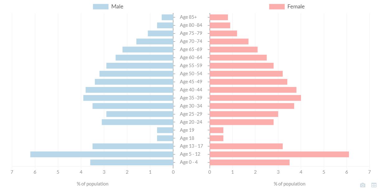
The Pyramid Chart is designed to show comparable indicators on either side of the chart, for example population values for males and females for the same set of age groups. If the data source for your report does not contain data that supports this type of display, the Pyramid Chart widget is very unlikely to give you the desired result.
The section below describes specific settings for the Pyramid Chart widget. Note that generic widget settings are described on the Widget Generic Settings page, so if you cannot find the setting you are looking for check there too. It is good practice to design your charts to be as accessible as possible.
Bars
Split data series
Choose whether to use a center or alternate split for the data series.
Axes
Labels position (x axis)
Choose the position of the X axis labels for the chart.
Text & Labelling
Data label – left/1st
Type the data label shown for the series displayed on the left side of the chart.
Data label – right/2nd
Type the data label shown for the series displayed on the left side of the chart.
To create a typical pyramid chart follow these steps:
- Drag the Pyramid Widget onto the page and adjust the size and margins as desired.
- In the Data & Settings panel, change the selected indicators using the Data tab. Select all indicator containing the age or age group values you wish to display. These should be identical for both male and female. You can choose to display total values or rates. If you have multiple dates available, you should only pick one single date which must be the same for all indicators.
- Click the button to change the aliases of your indicators to the labels you wish to see between the two sets of bars. Usually this would be just the age or age group such as ‘Age 0 – 4’.
- Your indicator order needs to be either sorted by sex e.g. first all age groups for male, then all for female (or vice versa) or it can be sorted by age group e.g. ‘Age 0 – 4’ for male and then ‘Age 0 – 4’ for female with male and female indicators alternating. If the latter is the case you would need to set Split data series to alternating.
- In the settings group Axes change the following:
- Allow label word wrap: off
- Label position (s axis): center (this removes repeated labels)
- Label width: 100 (Depending on the length and font of your labels this value could be smaller or larger. Pick one that just allows enough space for the longest label to be visible.)
- You may wish to add Grid lines or a Y axis title such as ‘% of population’.
- You may wish to change the colors of your bars using the Palette setting. The first color will be applied to the bars on the left and the second color will be used for the bars on the right.
- In the settings group Text & Labelling change the Data label left/1st and Data label right/2nd to ‘Male’ and ‘Female’ respectively. This will replace the legend labels which otherwise show the feature name.
- If you have set a y axis title you may find the legend looks better positioned at the top.