Widgets are the building blocks for your report. Widgets can be dragged into report pages from the Widgets menu to the left of the report. Commonly used widgets can also be added to the page using the widgets bar that floats over the report and contains buttons to add a widget, or to paste a widget that has been copied to the clipboard.
Once they have been added to a page, widgets can be selected by clicking on them and resized by clicking and dragging the handles on the widget outline. Widget outlines show by default but can be turned off using a setting available from the Ellipsis located in the Report Builder top panel.
When first added to the page, a widget will display a selection of data from the report source(s). Note that depending on the nature of the data in your data sources, Report Builder may not be able to draw a sensible widget until you make changes to the data and/or settings, particularly in the case of widgets that are highly data-dependent. Click on a widget to select it and a toolbar will appear in the top left corner.
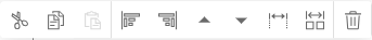
The Widget Toolbar provides access to the following options:
- Edit text & rules (text widgets only) – click to display the widget text editor and start editing the text.
- Cut – cut the widget.
- Copy – copy the widget.
- Paste (before) – paste a widget you have copied before the widget you have selected.
- Paste (into) – paste a widget you have copied into the widget you have selected. For example, you could paste a Bar Chart widget into a Text Box widget.
- Anchor left – anchor the selected widget to the left side of the page.
- Anchor right – anchor the selected widget to the right side of the page.
- Move up – move the widget up the order of widgets on the page.
- Move down – move the widget down the order of widgets on the page.
- Size: full width – set the widget to use the full width of the page.
- Size: half width – set the widget to use half the width of the page.
- Delete – delete the widget. You will not be asked to confirm the deletion. A deleted widget can be restored using the Restore option located in the Report Builder editor main menu.
Data & Settings Panel
The Data & Settings panel is located on the right and shows the information for the widget that is currently selected in the report (if not widget is selected this panel will be hidden). It allows the author to choose the data that will be shown in this widget and to change settings in order to control how this data will be displayed. The width of this panel can be changed by clicking and dragging the left border of the panel.
Data Tab
The Data tab is used to select the data indicator(s) that will be used in a widget.
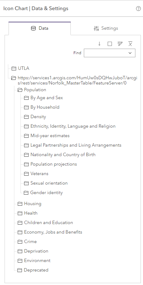
The data source(s) for your report are displayed using folders. The contents of a data source folder will look different depending on the type of data source. Data catalogs can have subfolders whereas the other types of data source do not.
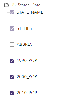
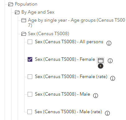
Each field or indicator in the data source has a checkbox that enables it to be selected. If the data source is a feature layer, CSV or table, you simply select the field(s) that you would like the widget to use.
If the data source is a data catalog, when you select the checkbox for an indicator, you can also decide what the dates setting should be. Click the Dates button immediately to the right of the indicator name.
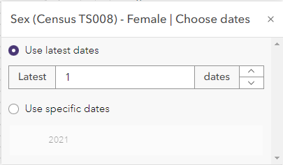
You can type in a number to show the latest X dates. In this case, the widget will automatically remain up to date when new date instances are added to indicators in the data catalog. Alternatively, you can choose for the indicator to show specific dates. In this case, it will always show these dates, even if the indicator gains new date instances in the data catalog.
There are buttons at the top of the tab to use with the data. These remain visible, even if you scroll the data tab.
- Scroll to next selected indicator – if the widget is already showing one or more indicators, click this button to scroll to the next selected indicator
- Select no indicators – click this button to deselect all currently selected indicators
- Set indicator aliases for this widget – click this button to set aliases for the indicator(s) selected for the widget, or to edit the order if multiple indicators are selected
- Indicator statistics – click this button to access the Indicator Statistics window
There is also a Find box that allows you to search for specific indicators by typing the name of the indicator. Any matching results will be displayed in a drop down menu. Click on the name of an indicator to automatically scroll to it in the data tab.
Settings Tab
The Settings tab groups the widget settings under different headings. The heading of each group can be clicked to expand or collapse it. Changes to settings take effect only after the Apply button below the tab is clicked. You can make changes to multiple settings under the same or different headings before clicking the Apply button.
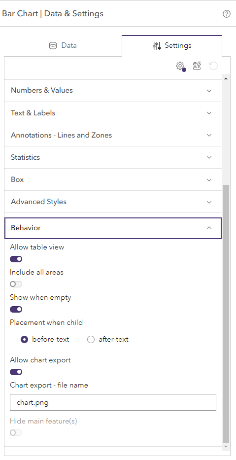
There are buttons at the top of the tab to use with the settings.
- Advanced – show/hide advanced settings
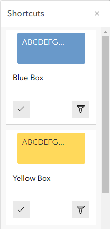
- Shortcuts – shortcuts are pre-defined combinations of settings to achieve a desired look and feel in a widget. The shortcuts displayed will depend on the type of widget you are editing. Each shortcut has two buttons. Update settings will update the settings that are used for this shortcut. Filter settings will filter to the settings that are used for this shortcut so that you can see them but will not update them.
- Clear will clear any filters applied to the list of settings as a result of applying a shortcut.