
There are two Bubble Plot configurations that are split between two different templates: The Scatter Plot (Standard Bubble Plot configuration) and the Advanced Bubble Plot.
These have been named with end-users in mind. The Advanced Bubble Plot configuration is so-called because it requires end-users to select up to four separate indicators for the chart (x axis, y axis, bubble size, bubble colour). These indicators can be changed independently by the end-user and you should therefore only choose this configuration if you wish to give them a high level of freedom for data exploration.
If you publish a report using the Advanced Bubble Plot template with a demonstration data file the result will look like that in the screen shot below.
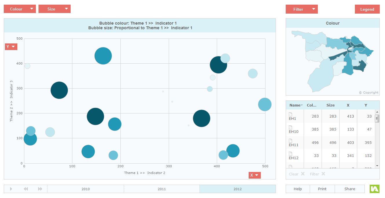
There are four buttons for changing data: the indicator shown in the map (this also controls the colour of bubbles in the chart), the indicator shown on the X axis, the indicator shown on the Y axis and the indicator that controls the size of the bubbles.
The Advanced Bubble Plot (HTML Edition) template contains two configuration options: IA6 Synchronised Dates and IA6 Standard. Within the IA6 Standard configuration the different Data Explorers are completely independent from each other whereas in the IA6 Synchronised Dates configuration the time periods are synchronised meaning all four variables will always show the same time period. The dates are not included in the Data Explorers but can be accessed through the Time Animation component. This configuration is only sensible if all available indicators contain the same dates.
When creating an Advanced Bubble Plot report you may want to define certain minimum and maximum axes values for the bubble plot component. You can define these settings on an indicator or theme basis in the ‘Metadata’ worksheet of your Excel workbook (or in the table ‘tblMetadata’ if you are working with the Access Data Manager). The settings are the same that you would use to fix the bar chart and/or time series chart (‘minChartValue’ and ‘maxChartValue’). Please see section ‘Setting the Chart Axis Minimum and Maximum’ for further information.
While this configuration is advanced from the end-user point of view, it is very simple from the point of view of the person creating the report. This is because this configuration does not require any associates to be provided in the data file(s).
Note that if you only want end-users to be able to plot three indicators simultaneously, you can remove the ‘Size’ button by editing the configuration file (config.xml) of the report using the Designer.