Contents
It is possible to provide indicator display metadata that will define how an indicator is displayed. This will allow you to set the following:
- Precision
- Data type
- Custom legends
- Whether a point geography layer is to display a numeric indicator value for the circle sizes and a categoric associate for the circle colours
- Chart axis minimum and maximum
- Additional data table columns
- Sorting the data table by a particular column and sort direction
- Whether a point geography layer is to show as a heat map or not
Indicator display metadata are defined in the ‘Metadata’ worksheet and the process for entering these is the same as for metatext. The example workbook contains some example indicator display metadata in the ‘Example Metadata’ worksheet. To activate this worksheet you would need to rename it to ‘Metadata’.
Setting the Precision for Indicators and Associates
Using metadata, it is possible to define a precision value for each indicator and associate. An example can be seen below:
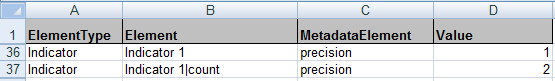
The image above shows how you can set a precision value for an indicator (row 2) or an associate (row 3). In the example above, the main indicator value will display with 1 decimal place, whereas the associate value ‘count’ will always be shown with two decimal places. Please note that precision is only used where the data type is numeric.
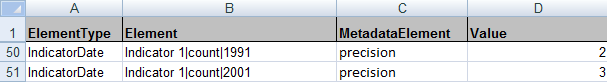
Precision settings can be defined on a theme, indicator and time period level. The image below shows an example of how to set different precision values for an associate column called ‘count’ for two different time periods for the same indicator.
If your indicator names are not unique, you can address this by adding the theme name in front of the indicator name in column B. Both must be separated by a pipe symbol, e.g. ‘Theme 1|Male’.
The following tables show the syntax of possible settings. The settings are hierarchical: a Theme is overridden by an Indicator, and an Indicator is overridden by an IndicatorDate. A setting that is higher in the list will always overwrite a setting from lower down for the particular element. For example if you set a theme to have a precision of 2, and also specify an indicator of this theme to have precision of 0, then the latter will overwrite the former for this particular indicator. In the tables below a * symbol is used as a wild-card and means any theme, indicator or associate column.
![]() The wild-card option is only valid for the ‘precision’ and ‘type’ metadata elements.
The wild-card option is only valid for the ‘precision’ and ‘type’ metadata elements.
For themes / indicators / dates:
| ElementType | Element |
| IndicatorDate | Theme Name|Indicator Name|Date |
| IndicatorDate | Indicator Name|Date |
| Indicator | Theme Name|Indicator Name |
| Indicator | Indicator Name |
| Indicator | Theme Name|* |
| Indicator | * |
| Theme | Theme Name |
| Theme | * |
For associates:
| ElementType | Element |
| IndicatorDate | Theme Name|Indicator Name|Associate Name|Date |
| IndicatorDate | Indicator Name|Associate Name|Date |
| Indicator | Theme Name|Indicator Name|Associate Name |
| Indicator | Indicator Name|Associate Name |
| Indicator | Theme Name|Indicator Name|* |
| Indicator | Indicator Name|* |
| Indicator | Theme Name|*|Associate Name |
| Indicator | *|Associate Name |
| Theme | Theme Name|Associate Name |
| Theme | *|Associate Name |
| Theme | Theme Name |
| Theme | * |
Setting a Data Type for Associates
The main indicator value data type is controlled in the iadatasheet and can be either numeric or categoric (see section ‘Entering Indicator Values (Columns C Onwards)’, sub-section ‘Row 4’). Where a data type is not supplied for an associate, the type will default to numeric. Should you wish to change the default setting for each associate, you can do this either in the iadatasheet in the cell directly above the associate column (row 4) or alternatively you can supply metadata. The data type controls how a particular data value is presented (such as alignment) and how it is sorted (numerically or categorically). The type for associates can be set on theme, indicator and time period level.
If your indicator names are not unique, you can address this by adding the theme name in front of the indicator name in column B. Both must be separated by a pipe symbol, e.g. ‘Theme 1|Male’.
For the data type of associates, the same syntax rules apply as for precision settings (please refer to the table ‘For associates’ in the previous section).
Setting Custom Legends
It is possible to set custom classifications for individual indicators or time periods. You can also set custom colours and labels for the display of the custom classification within a dynamic report. Furthermore you can define that a theme, indicator or time period appears with a specific legend classifier or legend palette by default.
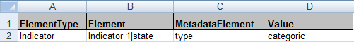
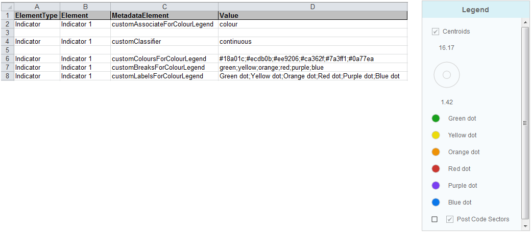
Custom classifications are defined in the ‘Metadata’ worksheet in the Excel Data Manager. The following image shows the ‘Metadata’ worksheet within the IAworkbook. A custom classification is set up for ‘Indicator 1’ which is a numeric indicator and for ‘Indicator 4’ which contains categoric values. The default legend classifier for ‘Indicator 2’ is set to Equal Interval and the default legend palette for this indicator will be the one called ‘Sequential Green Yellow’ in the config.xml file.
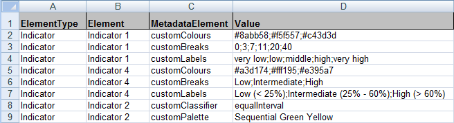
You can see from the image that the custom classification for both indicators (‘Indicator 1’ which is of type numeric and ‘Indicator 4’ which is of type categoric) is made up of three separate custom properties: customColours; customBreaks and customLabels.
If your indicator names are not unique, you can address this by adding the theme name in front of the indicator name in column B. Both must be separated by a pipe symbol, e.g. ‘Theme 1|Male’.
customColours
Use this property to set the colours for displaying individual classes or to set a colour ramp. If the number of colours you define in column D matches the number of classes in the custom classification then the colours will be displayed for each class in the same order in which you enter them in the worksheet. You can set just two colours and the dynamic report will create a colour ramp between them for as many classes as you have chosen.
customBreaks
Use this property to set the breaks between different classes. You should set one more value than the number of classes that you require i.e. if you want 5 classes you need to enter 6 values for breaks.
If you have categoric data then you must use the exact text label used within the data. Categoric breaks are case sensitive. Defining customBreaks for categoric indicators allows you to define the order of the categories as they appear in the legend.
If you are using a continuous legend you can provide a minumum and a maximum values in the customBreaks to customise the range of the continuous legend.
customLabels
Use this property to set the labels for each class that is displayed in the legend. The labels are applied in the order in which you enter them in the worksheet. You need to make sure that the number of labels matches the number of classes you have set up.
customClassifier
Use this property to set the default legend classifier for an indicator to one of the InstantAtlas standard classifiers. Valid values are ‘equalInterval’, ‘quantile’, ‘natural’, ‘continuous’, ‘standardDeviation’.
customPalette
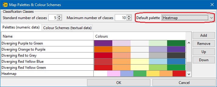
Use this property to set the default legend palette for an indicator to one of the legend palettes that are defined the config.xml file. Valid values are the names of the palettes in the configuration file. To find these, open up the config.xml file for your report in the Designer and click in the menu bar on ‘Styles’ and the ‘Palettes’. In the ‘Palettes (numeric data)’ tab you can find the palettes names for numeric indicators and the tab called ‘Colour Schemes (textual data)’ will show you the names of the categoric palettes.
Point maps: numeric indicator for size, categoric associate for colour
It is possible to configure a point map, so that it uses a numeric indicator for the circle sizes (proportional symbols) and a categoric associate for the colours of the circles.
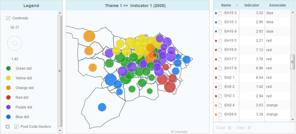
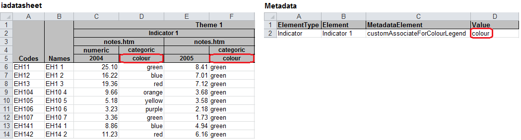
This feature can be enabled on a theme, indicator or time period basis by using the metadata element ‘customAssociateForColourLegend’ in the ‘Metadata’ worksheet of your IA Excel workbook. The value for this metadata element needs to be the name of the associate you wish to use for the point colours.
As a result the legend will split into a size part and a colour part.
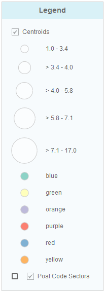
You can customise the size part of the legend by using the metadata properties ‘customClassifier’ or ‘customBreaks’ and ‘customLabels’. We suggest setting the legend classification to ‘continuous’ as this normally gives the best result in both the map and legend. The metadata properties ‘customColours’ or ‘customPalette’ will be ignored as the colour is driven by the associate (see below). Please refer to section Setting Custom Legends above for detailed instructions on how to use these metadata properties.
The colour part of the legend can be customised using a separate set of metadata properties (each of these can be set on theme, indicator or date level):
customPaletteForColourLegend
Use this property to assign one of the predefined categoric colour schemes. The value for this property needs to be the exact name of the colour scheme as defined in the configuration file. To find these, open up the config.xml file for your report in the Designer and click in the menu bar on ‘Styles’ and the ‘Palettes’. Switch to the tab called ‘Colour Schemes (textual data)’ to see the names of the categoric palettes.
customColoursForColourLegend
As an alternative to assigning a predefined colour scheme, you can use customColoursForColourLegend to specify the colours for each category. Enter a semicolon delimited list of hexadecimal colour values. The metadata element customColoursForColourLegend takes precedence over customPaletteForColourLegend.
customBreaksForColourLegend
Use this property to specify a particular order of the categories in the legend. Use a semicolon as the delimiter between the categoric values.
customLabelsForColourLegend
To give each legend category a different label use customLabelsForColourLegend and provide a semicolon delimited list of custom labels as a value.
The image below shows an example of a metadata sheet utilising a selection of the above metadata properties, together with the resulting legend.
When showing both a numeric indicator (circle sizes) and categoric associate (circle colours) simultaneously in the map, you may wish to adjust the map tips to display the associate value as well as the indicator value. By default the map tip displays the feature name followed by the indicator value. Please refer to subsection Tip of the Designer Map Properties section for information on how to customise the map tips.
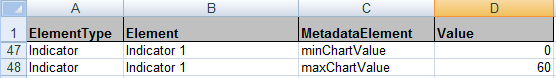
Setting the Chart Axis Minimum and Maximum
By default the bar chart and time series chart adjust their minimum and maximum depending on the data the chart shows. This might not be suitable e.g. when using a time animation. To set the chart minimum and maximum to a fixed value for each theme or indicator you can use the metadata elements ‘minChartValue’ and ‘maxChartValue’.
![]() Please note that these two properties are depended on each other which means you can only use them together. Just setting the ‘maxChartValue’ without having the ‘minChartValue’ defined will not have any effect.
Please note that these two properties are depended on each other which means you can only use them together. Just setting the ‘maxChartValue’ without having the ‘minChartValue’ defined will not have any effect.
If your indicator names are not unique, you can address this by adding the theme name in front of the indicator name in column B. Both must be separated by a pipe symbol, e.g. ‘Theme 1|Male’.
Defining Additional Data Table Columns
Any column defined on a theme, indicator or time period basis through the ‘Metadata’ worksheet gets added to the right of the columns that are already defined in the config.xml file. You should therefore define all columns that you wish to be displayed for all themes, indicators and time periods globally in the data table properties in the Designer.
![]() Please note that if you define an associate column using the Designer that only exisist for a subset of indicators, it will be hidden from the table for those indicators that do not contain this associate column in the datafile. This already provides the flexibitity of showing different associate columns for different indicators without having to define metadata.
Please note that if you define an associate column using the Designer that only exisist for a subset of indicators, it will be hidden from the table for those indicators that do not contain this associate column in the datafile. This already provides the flexibitity of showing different associate columns for different indicators without having to define metadata.
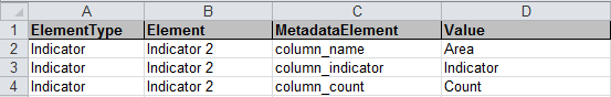
However, if you wish to adjust the column labels or order of the columns in your data table depending on the indictaor selection, you will need to set up these columns in your ‘Metadata’ worksheet (do not include them in the Designer).
The MetadataElement for the Name column is ‘column_name’. The column containing the indicator values can be set up using ‘column_indicator’ or ‘column_value’ as the MetadataElement. For associate columns use ‘column_{associateName}’ e.g. ‘column_count’. In the ‘Value’ cells of column D you can define the aliases of the new data table columns. Examples can be seen below.
If your indicator names are not unique, you can address this by adding the theme name in front of the indicator name in column B. Both must be separated by a pipe symbol, e.g. ‘Theme 1|Male’.
Please note that it is currently not possible to add columns containing the confidence limits ‘ul’ and ‘ll’ in this way. Also this functionality is not supported for the Double Map Template.
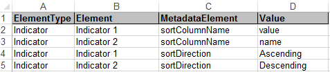
Sorting the data table differently for different indicators
The administrator of a dynamic report can define for each theme, indicator or date which data table column should be used to sort the table. The two MetadataElements are called ‘sortColumnName’ and ‘sortDirection’. They will overwrite the global settings from the Designer.
Setting up Heat Maps
The InstantAtlas HTML templates can display a point base geography as a heat map. A heat map is often defined as a visual representation of data using colours. Different to a choropleth map however, the colouration of a heat map (in a map context) does not correspond to geographic boundaries.
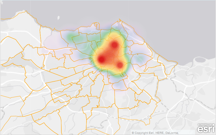
Whether or not a theme or an indicator is rendered as a heat map can be set in the ‘Metadata’ worksheet using the MetadataElement ‘heatmap’ (column C). The value in column D should also be ‘heatmap’.

It is possible to set a fixed radius for the heat map points using the MetadataElement ‘heatmapradius’.

This property expects a numerical value and has two effects: First, the radius of the heat map points will be adjusted to the new radius value (in map units). Second, the radius will be fixed for all zoom levels and will not change dynamically when a user zooms in and out of the map.
If your indicator names are not unique, you can address this by adding the theme name in front of the indicator name in column B. Both must be separated by a pipe symbol, e.g. ‘Theme 1|Male’.
![]() The config.xml files contains a predefined colour palette suitable for heat maps. You can either select this as the default palette through the Designer or associate this palette to your heat map indicator using the MetadataElement ‘customPalette’, see ‘customPalette’.
The config.xml files contains a predefined colour palette suitable for heat maps. You can either select this as the default palette through the Designer or associate this palette to your heat map indicator using the MetadataElement ‘customPalette’, see ‘customPalette’.