
Contents
The Designer has menus, a toolbar and a canvas. The menus and toolbar give you access to the various functions, such as opening a configuration file, and the canvas allows you to view the various template components (e.g. map, data table, bar chart, bar chart title, etc.).
Menus and Toolbars
The image below shows the Designer menus and toolbar.

The menus and toolbar give you easy access to the Designer options. You can access a menu by clicking on it or holding down the ‘Alt’ key on your keyboard and pressing the underlined character in the menu name. For example, you can hold down ‘Alt’ and press ‘F’ to access the File menu. Note that these keyboard shortcuts exist for many functions in the Designer. If you hold your mouse pointer over an option in any of the drop down menus, a tooltip will appear. Similarly, if you hold your mouse pointer over an icon in the toolbar, a tooltip will appear.
File
Open
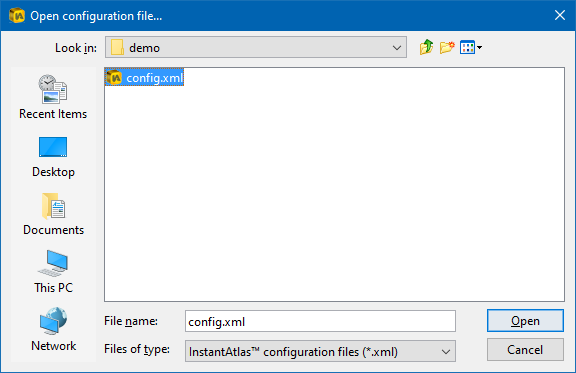
Click ‘Open’ and the ‘Open configuration file…’ dialog will appear. Alternatively hold down ‘Ctrl’ and press ‘O’ on your keyboard. Choose the file called ‘config.xml’ for the report you wish to change and click ‘Open’.
Save
Click ‘Save’ to save changes to the configuration file you are changing. Alternatively hold down ‘Ctrl’ and press ‘S’ on your keyboard. The changes are saved to both the config.xml as well as the config-vars.xml.js file of your report. When restarted, the dynamic report will reflect any changes that you have made in the Designer.
Save As
Click ‘Save As’ if you wish to save your changes to a new configuration file. Alternatively hold down ‘Ctrl’ and ‘Shift’ and press ‘S’ on your keyboard, the ‘Save configuration file as…’ dialog will open. Browse to the folder in which you wish to save your new configuration file, type a name in the ‘File Name’ box and click ‘Save’.
This option is useful if you wish to save different designs for a report. Simply save the different configuration files to the report’s folder with names such as ‘config1.xml’, ‘config2.xml’, ‘config3.xml’, etc. The Designer will save the corresponding file variants for local use with respective names such as config1-vars.xml.js’, ‘config2-vars.xml.js’, ‘config3-vars.xml.js’, etc. Once you have saved these files, you simply choose which one is active by renaming it ‘config.xml’ and ‘config-vars.xml.js’ respectively. This is because by default an InstantAtlas report looks for a configuration file in its folder called ‘config.xml’ (or ‘config-vars.xml.js’ for use with the atlas-launch.html file) and will ignore any others.
Revert
Click ‘Revert’ and then ‘To Template’ if you wish to return to the original design, thereby reversing any changes you have made. Click ‘Revert’ and then ‘To File’ if you wish to return to the design as it was when you last clicked ‘Save’.
Recent Files
Click ‘Recent File’ to access a list of recently opened files.
Close
Click ‘Close’ to close the Designer. If you have not saved your changes, you will be prompted to do so.
Edit
Undo
Click ‘Undo’ to undo changes that you make to your design. Alternatively hold down ‘Ctrl’ and press ‘Z’ on your keyboard. Most changes can be undone in this way. You can click ‘Undo’ multiple times in a row to undo a series of changes. This option will be greyed out if there are no changes to undo.
Redo
Click ‘Redo’ to reapply any changes that you have undone by clicking ‘Undo’. Alternatively hold down ‘Ctrl’ and press ‘Y’ on your keyboard. You can click ‘Redo’ multiple times in a row to reapply a series of changes. This option will be greyed out if there are no changes to reapply.
Delete
All of the components (e.g. charts, chart titles, buttons, etc) can be deleted. To delete a component, click on it to select it in the interface and then click ‘Delete’. Alternatively you can press ‘Delete’ on your keyboard. The component will disappear.
General Properties
Click ‘General Properties’ to access the general properties for the dynamic report. Alternatively hold down ‘Ctrl’ and ‘Shift’ and press ‘P’ on your keyboard. This will show the general properties in the pane located on the right side of your designer window. See the section below for more instructions on changing properties.
Select
The ‘Select’ menu allows you to easily select components in your report. This is useful if you want to change properties of a component that is hidden behind another component e.g. the data explorer that might be hidden behind the map.
Insert
Button
Click ‘Button’ to insert a new button that will be displayed in your report and can be made to link to a resource of your choice (e.g. a webpage or a PDF document saved on your computer). You can also use the new button to toggle components or call JavaScript commands. Click on the new button in the canvas to select it and drag it to the desired location. If necessary, you can resize it by dragging the selection handles. Refer to the section ‘ Button Properties’ for instructions on changing the properties for your new button.
Image
Click ‘Image’ to insert any static image of your choice into your report. This might be the logo of your organisation or a corporate banner for example. JPEG, PNG and GIF image formats are all supported. Click on the new image in the canvas to select it and drag it to the desired location. If necessary, you can resize it by dragging the selection handles. For instructions on how to make changes to the properties of your new image please refer to the section ‘Image Properties’.
Text
Click ‘Text’ to insert any text of your choice into your report. Click on the new text in the canvas to select it and drag it to the desired location. For instructions on how to make changes to the properties of your new text please refer to section ‘Text Properties’.
Deleted components and components that are hidden by default
You have the option of inserting previously deleted components and various components that are not shown by default in your InstantAtlas reports. Click on the ‘Insert’ menu.

Layout
The ‘Layout’ options allow you to rapidly align multiple objects. You must first select multiple components to align – you can do this by holding down the ‘Shift’ button on your keyboard while clicking components in the canvas.
 Note that it is possible to move selected components as a group simply by clicking and dragging any of the selected components.
Once you have selected two or more components, the layout options become active. These are available from the menu but also from the properties pane on the right.

Simply click the option for the alignment you wish to achieve.
Style
Edit Styles
Click ‘Edit Styles’ to open the InstantAtlas Style Editor. This tool lists all the styles used by the report. Note that most of these can be edited via the Designer (see below). It is therefore unlikely you will need to use the Style Editor unless you are making advanced style changes (e.g. adding new styles or making global style changes).
Palettes
Click ‘Palettes’ if you wish to edit the palettes or colour schemes used to shade the map features in your dynamic reports. The ‘Map Palettes & Colour Schemes’ dialog will open. For instructions on how to make changes please refer to section ‘Editing Map Palettes’.
View
The View menu contains a list of zoom options. Choose a new zoom level to zoom into or out of the canvas. Alternatively, choose ‘Fit’ to make the canvas fit the Designer window. There are keyboard shortcuts for each zoom level (shown to the right of the zoom percentage).
Help
Help on the Designer
Click ‘Help on the Designer’ to access the help pages for the Designer.
About
Click ‘About’ to open the ‘About’ dialog. It contains information regarding your Designer application, including the version number and the location of your licence file.

There are also three buttons linking to additional information. The ‘Legal’ button links to the InstantAtlas End-User Licence Agreement. The ‘Licence’ button links to ‘Licence File Information’, from which you can also upload a new licence file. The ‘Templates’ button links to an overview of available templates and also allows new templates to be uploaded.
The Designer Canvas
The image below shows an example of the Designer canvas in ‘Wireframe View’ with the Properties Pane.
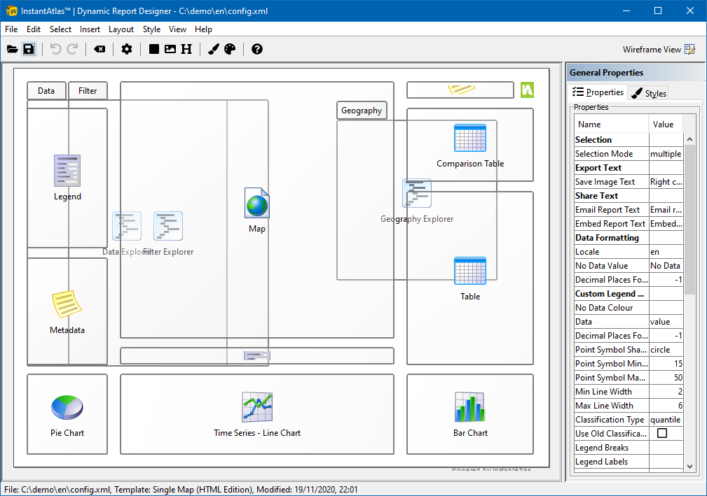
The size and position of the components in your report are shown in the canvas. You can click any component to select it. When selected, a component gains a dashed border with resize handles. To resize a component, hover over a resize handle until a double-sided arrow appears, click and hold down the mouse over the handle, then move the mouse to see the component resize. You can move components by hovering over a component (but away from the resize handles); then click and hold down your mouse key and move the mouse to move the component. To deselect a component, click on an empty part of the canvas. Clicking on an empty part of the canvas will also cause General Properties to appear in the right-hand panel of the screen. When a component it selected, the component’s properties will show in the properties pane on the right side of the Designer window instead.