
Contents
Configuration
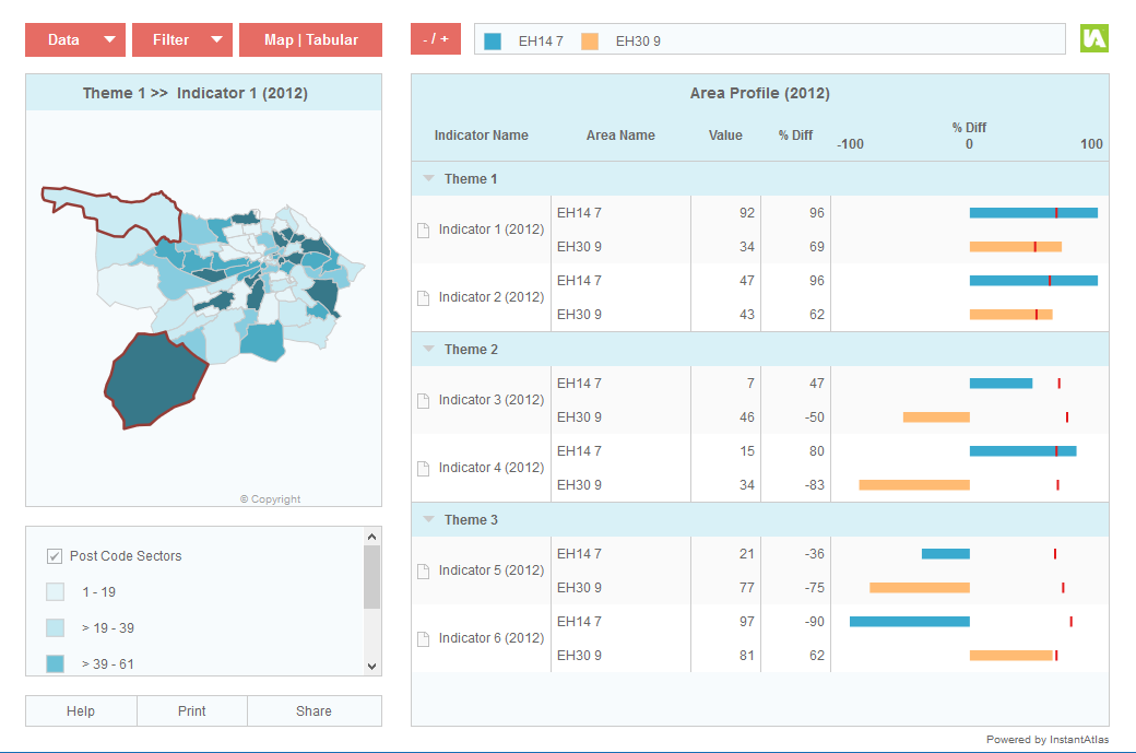
With this configuration the main chart is configured to be a spine chart. This has a central spine and horizontal bars to either side of this that show whether indicator values for the selected area(s) are above/below a given comparison value. If you publish this with a demonstration data file the report will look like that in the screen shot below.
You can alter this configuration once you have published a report by opening the config.xml file using the Designer.
Customising the columns of the chart
It is possible to show a variable number of columns in the spine chart and each one can be configured separately. The properties that can be set for each column are described below:
Alias – the heading displayed for the column.
Width – this will be the width of the column as a percentage of the whole chart.
Name – this will define the data source for the column. If the column should display indicator values (i.e. thematically mapped values) the value should be ‘value’. If the column should display associate values, the Name should be the name of the associate exactly as in the JSON data file(s) for your dynamic report (e.g. ‘diff’ or ‘baseline’). From version 6.10.0 onwards, spine chart columns can also show values from comparsion features. For this to work, the Name needs to contain the ID of the comparison feature (without the # symbol).
If you wish to show symbols, stand alone, in a column you will need to define the Name as ‘symbol(symbolValue:associate name)’ where associate name refers to the name exactly as in the JSON data file(s) for your dynamic report (e.g. ‘trend’ or ‘state’). You can define the actual symbols for the values in the properties section of the Spine Chart Properties.
If you wish to show symbols and text within the same column you will need to define the Name as:
symbol(symbolValue:associate name,textValue:value)
Note that “associate name” refers to the name exactly as in the JSON data file(s) for your dynamic report (e.g. ‘trend’ or ‘state’). The “value” refers to either the indicator value or if you would like it to show the symbol with the text of an associate value you should change “value” to the associate name exactly as in the JSON data file(s) for your dynamic report (e.g. ‘trend’ or ‘state’).
You can also define the alignment of the symbol using ‘symbolAlign:{right, left, centre}’, for example:
symbol(symbolValue:state,textValue:value,symbolAlign:right)
or
symbol(symbolValue:trend,symbolAlign:center)
By default, the name of a selected map feature will be shown in one of the columns of the spine chart and also in the Selected Features Legend above the spine chart.
Setting the time periods to show
Having multiple time periods for each indicator is optional. By default, the Area Profile template opens up showing the indicators of the selected date. You can change this to display either the most recent date of each indicator (irrespective of the selected date) or all dates. The Spine Chart property for this is called ‘Display Indicators For’. You can choose whether or not the time periods should be displayed in brackets behind the indicator names by using the property ‘Display Dates in Profile’.
Defining target symbols
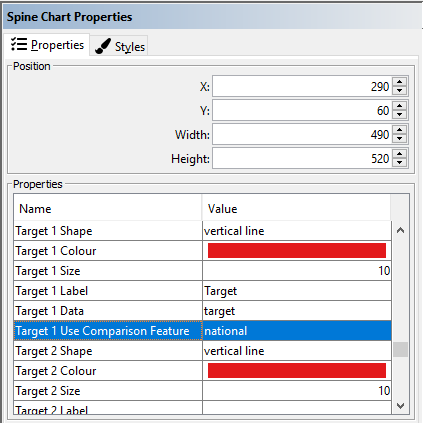
You may wish to display a symbol over the bars of the spine chart to denoting the target an area should achieve. These target values would usually be set up as an associate column in your data file(s) – please see an example in the Data Preparation section below. In the Spine Chart Properties in the Designer you can define up to four targets. Each target is defined by a ‘Shape’, ‘Colour’, ‘Size’, ‘Label’ and ‘Data’. The ‘Target Data’ property needs to match the name of the associate column from your data.
You can also display the values of a comparison feature as targets in the spine chart. In this case the ‘Target X Use Comparison Feature’ property (where X is the number of the target 1-4) needs to match the ID of the comparison feature (without the # symbol).
In most cases, administrators will want the indicator value of the comparison feature to be used rather than an associate value, hence you should enter ‘value’ into the Target X Data property (where X is the number of the target 1-4). Alternatively, you can pick up associate values of the specified comparison feature. In this case enter the name of the associate column you wish to use.
There are many other properties for the spine chart that can be changed to further tailor the appearance/functionality. You can move your mouse pointer over property names in the Designer to see a description. If you are not sure what a particular property is used for please contact your support provider.
Data Preparation
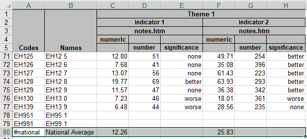
An example of how you can prepare your data is provided in the Excel workbook called IAworkbookAreaProfile_SpineChart.xls. This is located in the ‘workbooks’ folder of your InstantAtlas software. The default location for this is:
C:\Program Files\EsriUK\InstantAtlas\workbooks.
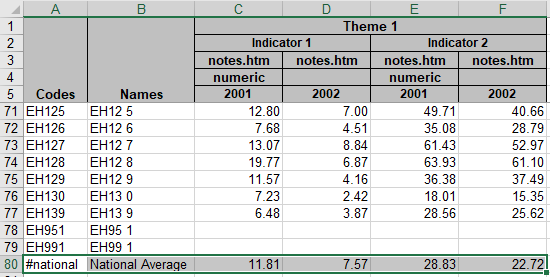
The required data structure is shown in the worksheet called ‘iadatasheet’ and is shown in the figure below.
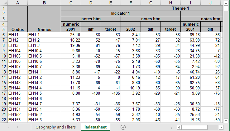
By default, the horizontal bars in the spine chart are configured to use an associate called ‘diff’. These values can represent anything you like and it is up to you to populate the column accordingly.
It is possible to set up the report so that it calculates the % diff values as a percentage difference between the indicator value for the base geography area and the indicator value for a comparator. The comparator can be anything you like but is typically a national or regional average – it must be the same for all base geography areas and all indicators
For this functionality, the Spine Chart contains a setting in the config.xml file called Comparison Id For Calculating Bar Value. Enter here the code of the comparison feature as defined in column A of your Geographies and Filters worksheet (if using the Excel Data Manager) but without the # character.
As in this case you are not providing an associate with the % diff values, you should change the Bar Data property to ‘value’ (or a relevant associate column name). The same column will be used for the comparison feature.
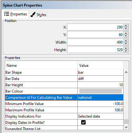
If the new property is filled with a valid comparison ID, the percentage difference values will be calculated using the following formula:
100 * ((base area indicator value – comparator value) / comparator value)
This will give you positive difference values where the base area value is higher than the comparator value and negative difference values where the base area value is lower than the comparator value.
It is currently not possible to display the calculated % diff values as numbers in a separate column of the Spine Chart.
The ‘target’ associate is optional. If you include target values these will be shown as little vertical markers superimposed on the horizontal bars. These will show whether the target for a particular indicator has been reached or not. If you do not include the ‘target’ associate, these markers will not show.
In addition to ‘diff’ and ‘target’ associates, you can include any others associates described in section ‘The InstantAtlas Excel Data Manager’, sub-section ‘Entering Associate Values’ (e.g. ‘ll’, ‘ul’ or ‘count’) or your own custom associates.