
Funnel plots are scatter plots upon which confidence limits have been superimposed. These confidence limits are plotted for a regional or national average. The limits enable you to see which observations are significantly different from the regional/national average. The confidence limits form a funnel shape because these decrease as sample/population sizes shown on the X axis increase.
If you publish the Funnel Plot configuration with a demonstration data file the report will look like that in the image below.
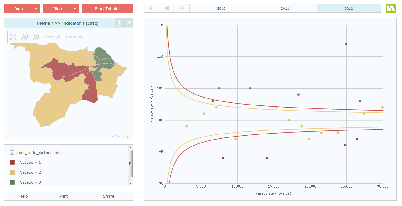
The regional/national average is shown as a horizontal green line across the chart. The yellow and red curves are the upper and lower 95% and 99% confidence limits plotted for the regional/national average. Points that lie above/below the upper/lower curves are significantly different from the regional/national average. Points that lie within the funnel are not significantly different from the regional/national average.
There is only one ‘Data’ button and this is used by the end-user to change the indicator values in the map.
The Funnel Plot configuration of the HTML Scatter Plot template uses associates called ‘xValue’ and ‘yValue’ as data sources for the funnel plot axis.
xValue – the X axis values for the chart. Typically, these are sample/population sizes. In public health for example, it is common to show Standardised Mortality Ratios (SMRs) on the Y axis and the expected number of deaths on the X axis.
yValue – the Y axis values for the chart.
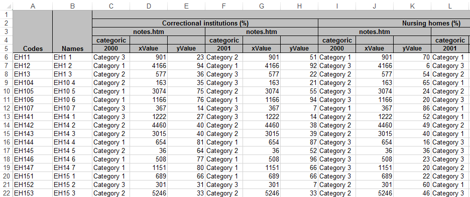
The required data structure is shown in the ‘iadatasheet’ worksheet of the workbook called IAworkbookBubblePlot_FunnelPlot_HTML.xls. This workbook can be found in the ‘workbooks’ folder of your InstantAtlas installation.
If your indicator values shown in the map are numeric and you wish to use them for the Y axis as well you need to enter ‘value’ into the ‘X-Axis Data’ property of the Bubble Plot component in the Designer.
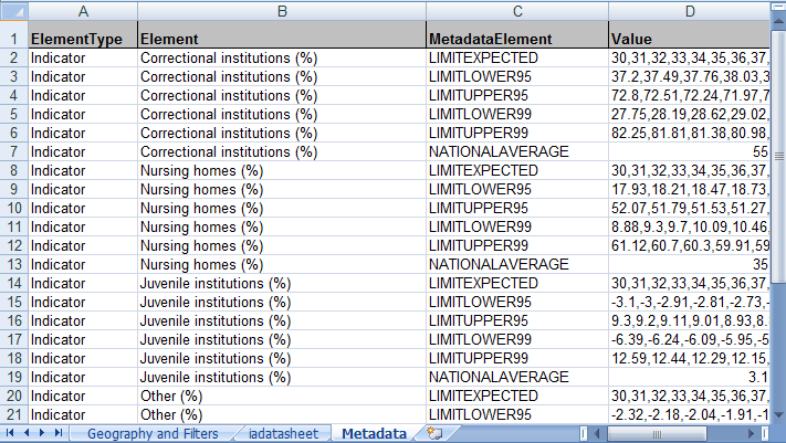
For every indicator, you must also supply values for six properties (below) in the data file(s) for your report. In your Excel workbook, you add these into the Metadata worksheet.
The first property defines the average for the region or nation:
NATIONALAVERAGE – the regional/national average
The remaining five properties are used to plot the confidence limits:
LIMITEXPECTED – an array of the X axis values used to plot the confidence limits. These should be the sample/population size the confidence limits have been calculated for.
LIMITLOWER95 – an array of the 95% lower confidence limits calculated for the regional/national average based on the sample/population sizes in the LIMITEXPECTED array.
LIMITUPPER95 – an array of the 95% upper confidence limits calculated for the regional/national average based on the sample/population sizes in the LIMITEXPECTED array.
LIMITLOWER99 – an array of the 99% lower confidence limits calculated for the regional/national average based on the sample/population sizes in the LIMITEXPECTED array.
LIMITUPPER99 – an array of the 99% upper confidence limits calculated for the regional/national average based on the sample/population sizes in the LIMITEXPECTED array.
The delimiter in the arrays depends whether Excel is using points or commas as decimal separators. If the decimal separator is a point, the delimiter in the arrays must be a comma. If the decimal separator is a comma (e.g. if the regional setting of your operating system is French, Spanish or German) the delimiter in the arrays must be a semi-colon.
Refer to the ‘Metadata’ worksheet in the Excel workbook called IAworkbookBubblePlot_FunnelPlot_HTML.xls .
An easy way of creating and entering an array is described below. In this example commas are used as delimiters.
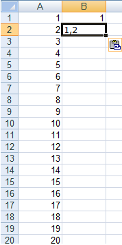
Start with a column in a new Excel workbook that contains the numbers for the array. The values 1, 2, 3… displayed in the image below are example values only. In reality, these will be the actual values that you wish to use to plot the confidence limits.
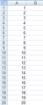
In cell B1 type =A1
In cell B2 type =CONCATENATE(B1,”,”,A2)
Copy the formula in cell B2 down until you reach the last value in column A. You can do this by clicking in cell B2 and double clicking the handle to the bottom right of the cell border.
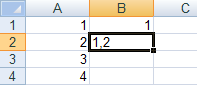
Your worksheet should now similar to that shown below.
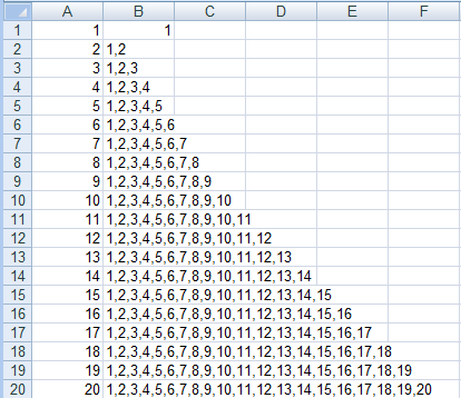
Copy the value in the bottommost cell in column B into your clipboard.
In the Metadata worksheet of your Excel Data Manager, right click in cell that will contain the array and choose ‘Paste Special…’. The dialog shown below will appear.
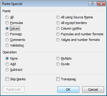
Click the ‘Values’ radio button and click ‘OK’.
If you need the array delimiter to be a semi-colon rather than a comma your formula in cell B2 will be =CONCATENATE(B1,”;”,A2)