
With this configuration the chart is a normal bi-variate scatter plot. The points in the chart are all the same size. The colours of the points/bubbles will always be linked to the legend classes.
If you publish this configuration with a demonstration data file the report will look like that in in the screen shot below.
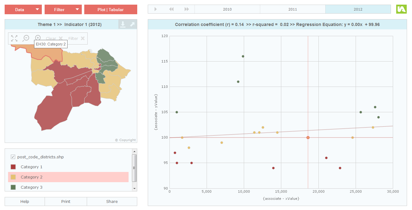
The Scatter Plot configuration uses associates called ‘xValue’ and ‘yValue’ as data sources for the scatter plot axis. If you wish to give the end-user the ability to select indicators to be used for the scatter plot axis you need to publish a report using the Advanced Bubble Plot template and delete the value of the ‘Bubble Size Data’ property in the Designer.
You can also enable the display of a correlation line in the Bubble Plot properties if you wish.