
Contents
Introduction
This guide explains how to use the Dimensions Explorer component which is available for all HTML templates from version 6.9.0 onwards.
The Dimensions Explorer is a highly customizable component that allows for filtering of indicators based on predefined dimensions or categories. In difference to the Data Explorer which lists all themes, indicators and dates in a tree like structure, this component will only display indicators that meet the specific filter conditions selected by the end user.
The component requires definitions to be made in the InstantAtlas Designer and in the Metadata sheet of the Excel workbook.
Data Preparation in Excel
The ‘Metadata’ sheet is used to assign indicators to the categories that shall appear in the component. As the Dimension Explorer only supports indicators (not themes or instances) the ElementType has to be set to ‘Indicator’, while Element holds the name of the indicator as defined in the iadatasheet. MetadataElement holds the name of the dimension and Value defines the value an indicator has in this dimension.

If an indicator should belong to more than one dimension, each condition has to be mapped out for that indicator on a separate row.
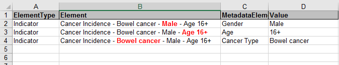
These definitions have to be set for every indicator and every dimension it should appear in. Note that indicators and dimensions can be named freely and do not to follow a naming convention in order to be categorized.
Example:
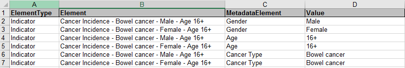
Two indicators called ‘Cancer Incidence – Bowel cancer – Female – Age 16+’ and ‘Cancer Incidence – Bowel cancer – Male – Age 16+’ shall be be available in filters for gender, age and cancer type. This requires MetadataElements for each of the dimensions and both indicators to be sorted into each dimension with its value:
Designer
The Dimensions Explorer component has a number of properties that define the appearance of the widget:
Indicator Properties
Each dimension that shall be selectable by the end user, needs to be defined in Indicator Properties. Click on the blank field to assign values to an index.
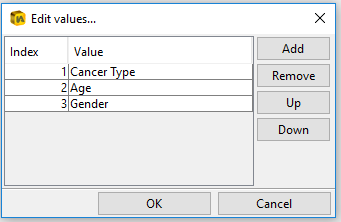
The names under ‘Value’ need to match the dimension names defined in the MetadataElement in Excel. Each dimension will be displayed as a drop down list from which the end user can pick values to filter the indicator list. By moving dimensions up and down in the list, the order of drop down menus can be changed in the component.
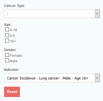
Use Checkboxes
Indicator Properties are displayed as drop down list by default. By assigning a dimension to the ‘Use Checkboxes’ property, the drop down list will be replaced by a set of check boxes, allowing the end user to pick multiple values instead of just one. Click on the blank field to assign dimensions. The order of the list has no effect on the order of dimensions in the widget. Note that any dimension still needs to be defined in ‘Indicator Properties’ in order to appear in the component.
Indicator Text
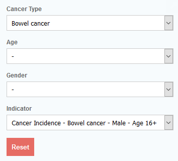
This is the text displayed above the results drop down menu and can be changed to something else by replacing ‘Indicator’.
Reset Text
The text of the button that resets the selection made by the end user.
No Selection Text
The ‘No Selection Text’ acts as a placeholder in drop down lists if no value is picked from the list.