
Contents
Introduction
This guide describes the use of the InstantAtlas Pyramid Chart component which is available within the Population Pyramid template.
The Pyramid Chart displays indicator data belonging to a map feature in a back-to-back horizontal bar chart. This chart is typically used to show population structure broken down by age groups and gender.

Preparing the Data for your Report
You can find an example Excel workbook containing the required data structure for the pyramid chart in the InstantAtlas Desktop installation folder. This fine is called ‘IAworkbookPopulationPyramid.xls’ and is saved by default in the folder:
C:\Program Files\EsriUK\InstantAtlas\workbooks
For the Pyramid Chart to work, you will need to organise your data in two themes. The first theme will populate the right side of the chart and the second theme will populate the left side of the chart. When the Pyramid Chart is used to display population data, the first theme would contain the values for the male part of the population whereas the second theme would contain the values for the female part.
Both themes need to have the same number of indicators. The indicators also need to have exactly the same names in both themes. When the chart is used to display population data, the indicators would represent different age groups.
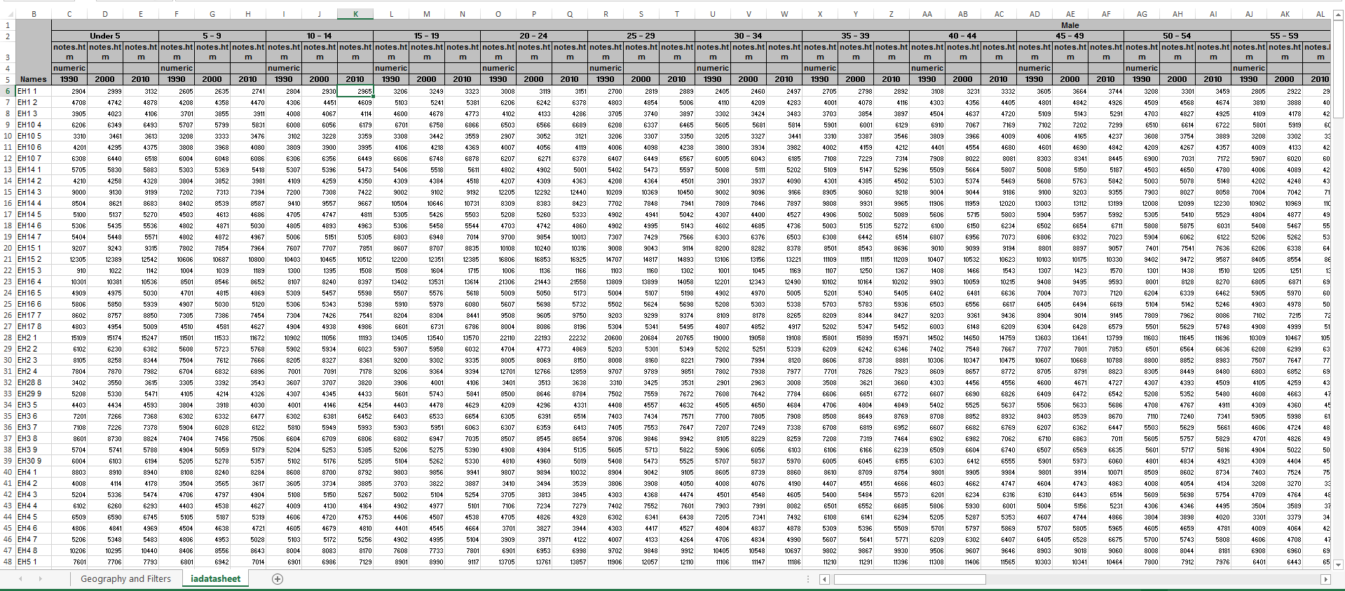
You can include data for different time periods for the indicators; however, you should have the same time periods for all indicators in both themes. The image below shows how the ‘iadatasheet’ worksheet of your Excel Data Manager would look for an example with population data.
Configuration Properties
Legend Data Labels
By default the data labels as shown in the chart legend are ‘Males’ for the right side of the chart x-axis and ‘Females’ for the left side of the chart x-axis. You can change these labels in the Pyramid Chart properties.
Use Fixed Values? and Fixed Maximum Value
By default the chart X-axis will always start at zero and automatically set its maximum limit. But it is possible to apply a fixed maximum value by ticking the ‘Use Fixed Values?’ box and set the value in the ‘Fixed Maximum Value’ property.
Show Associate Data
It is possible to show data from up to 3 associate columns as lines in the chart. By default, the Population Pyramid template is set up to show the associate data ‘predicted’ in addition to the indicator data in the pyramid chart.
In the Designer, in the Pyramid Chart Properties panel, you can define the ‘Value’ (which is the data source and should contain the name of the associate column), the ‘Colour’ of the line and the ‘Label’ which appears in the pyramid chart legend.
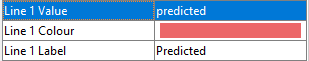
The image below shows how the associate ‘predicted’ is set up in the workbook.
Always Show Comparison Data
You should enable this property if you wish to see a permanent comparison line in the chart for all comparison features. If this property is disabled, the user will still be able to toggle the comparison lines on by selecting the comparison features from the Comparison Table.