When you create/edit a dashboard using Dashboard Builder you will be presented with a screen similar to that shown below. A dashboard based on an ArcGIS Online web map is shown on the right hand side, a settings panel is shown on the left hand side and there are a number of menu options shown on the top bar. These various areas are described below.
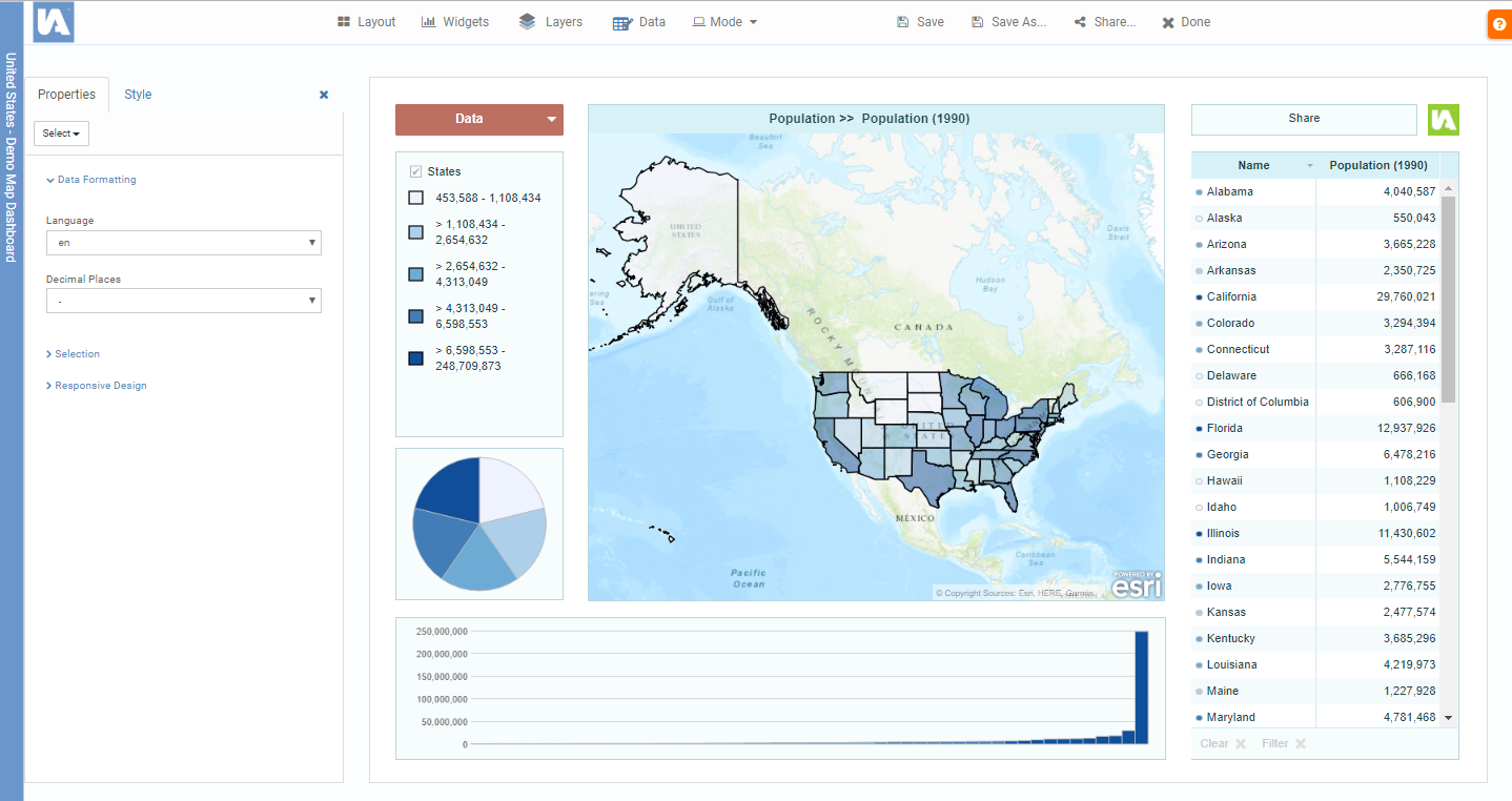
Dashboard Title
The title of the dashboard you are currently editing can be seen in the blue vertical bar to the very left of the screen. You can change the dashboard title in the item properties in the ArcGIS Online content.
Edit/Preview Mode
On start-up, the mode of the dashboard is set to Edit, which means that you can change the design of your dashboard. Click on the Mode button at the top of the screen to put the dashboard into Preview mode so you can see how it will appear and behave once published. In preview mode the dashboard will show a Preview label.
Design
In ‘Edit Mode’ you are able to select different dashboard widgets by clicking on them. You can then drag them around the screen or resize them. You can delete a widget by clicking on the cross in the top left hand corner. Some dashboard widgets may be set to be hidden at start up or set as popups (e.g. the data explorer) so you won’t be able to see them. There may also be widgets that are hidden behind other widgets . To view these you will need to use the ‘Select’ menu within the properties panel to make them visible for positioning, resizing and setting their properties.
Settings
The settings panel on the left hand side of the page allows you to set the properties for each dashboard widget, define overall styling and change the legend settings. With the button the settings panel can be hidden so that the dashboard fills the width of your screen. A hidden settings panel can be restored by clicking the Settings button.
Properties Tab
This tab shows the properties of the selected widget. If you click on any blank space on the dashboard, the general properties for the dashboard will be shown. Except when the list of properties is very short, properties are organsied in property groups that can be collapsed and expanded by clicking on the group name. Hovering over a property will often display some help about that property. Many properties can be left with their default settings, others you can try changing to see what effect they will have on the dashboard. The properties for some of the more complex widgets are described in the respective widget page (expand the ‘Widgets’ option in the menu on the left).
The ‘Select’ button opens a list of all widgets which are currently in your dashboard. Clicking on a widget listed here will highlight it so you can edit the properties or resize / move it. This is especially useful for widgets which are completely hidden behind other widgets.
Use the ‘Send To Back’ and ‘Bring To Front’ buttons to control how overlapping widgets appear.
Style Tab
These settings allow you to change the overall look and feel of your dashboard. Firstly click on the Colour Scheme button to open the Colour Scheme dialog.
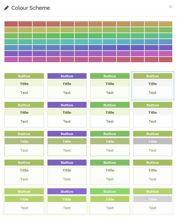
Chose a colour from the colour swatch at the top and then select one of the styles based on your selected colour. Afterwards you can fine-tune the styling by changing colours, fonts and borders of the widgets, widget headers and buttons as well as adjusting some general style settings for your dashboard.
Layout
The Layout menu option allows you to choose from a set of predefined dashboard layouts. These are a good starting point for designing your dashboard. Some layouts have widgets that are not available in other layouts. Note that when you switch layouts you will lose any design changes you have made. Some of the more complex layouts are described in the respective layout page (expand the ‘Layouts’ option in the menu on the left).
Widgets
Use this menu to insert additional widgets into the dashboard. Note that the range of widgets available will depend on the layout chosen using the layout menu.
 Layers
This button opens the Layer Manager. This allows you to set how the layers in the web map should be displayed in the dashboard.
Data
This button opens up the Data Manager. This allows you to select which data you would like to display in your dashboard and control how it appears.
Save
Saves all changes back to your app on ArcGIS Online.
Save As…
Saves a copy of this dashboard into your ArcGIS Online account. You will be able to change the title of the dashboard, tags and the folder where it is saved to.
Share
Opens the Share dialog.

Sharing
This allows you to control the viewing rights for the dashboard. You can choose to share with everyone, your organisation or specific groups of users.
Linking & Embedding
Here you can obtain the code for embedding your dashboard in another website.
Publish Data
If your dashboard is using data from an InstantAtlas Data Catalog and it is slow to load due to a large data model you can publish the data.json to a static file on the Azure storage to speed up startup. Please be aware that any updates you (or others) make to the data on ArcGIS Online will be ignored until the data is re-published.
Done
Takes you back to the Dashboard Builder home screen.
Help
Contains a Quick Start Guide and a link to the Dashboard Builder help pages.