Introduction
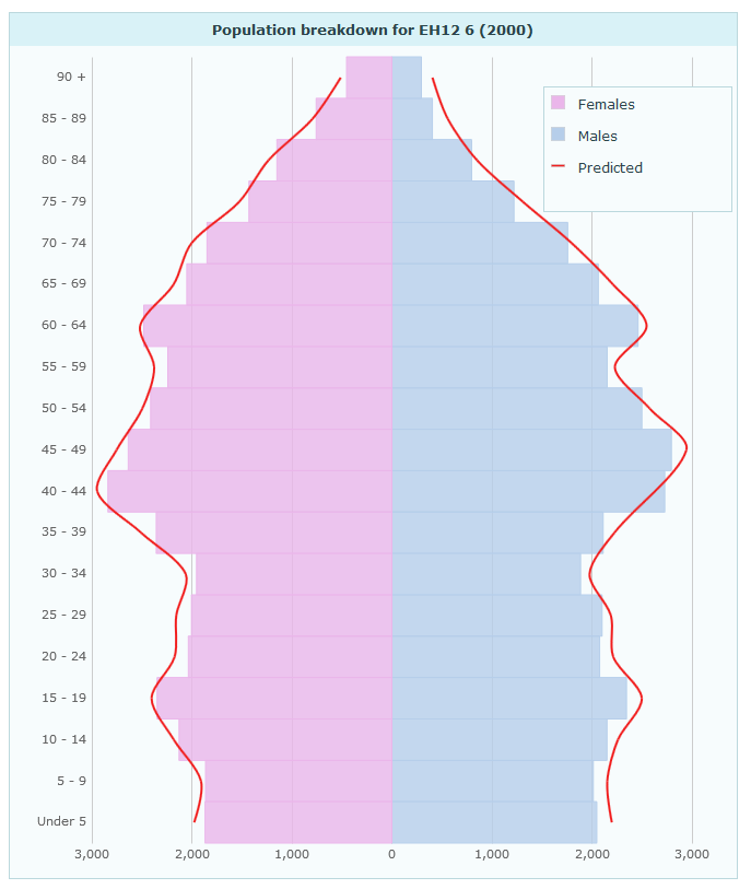
The Pyramid chart can be found in the Population Pyramid layout. It displays data belonging to one map feature in a back-to-back horizontal bar chart. This chart is typically used to show population structure broken down by age groups and gender:
Data
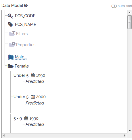
For the Pyramid Chart to work, you will need to organise your data in two themes. The first theme will populate the right side of the chart and the second theme will populate the left side of the chart. When the Pyramid Chart is used to display population data, the first theme would contain the values for the male part of the population whereas the second theme would contain the values for the female part. Additional themes are not supported. The data has to contain only the two themes required for the Pyramid Chart to work. Both themes need to have the same number of indicators. The indicators also need to have exactly the same names in both themes. When the chart is used to display population data, the indicators would represent different age groups. You can include data for different time periods for the indicators; however, you should have the same time periods for all indicators in both themes.
Properties
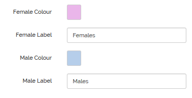
In the Pyramid Chart properties you can change the colour shades of the gender groups and the labels used in the Pyramid Chart Legend. By default, the females data is pink and the males data is blue:
You can also set up additional data lines, e.g. to show predicted data for the future. Ideally, you add this data as associates to the indicators in the data manager. In this example, the predicted data is labelled “Predicted”. The corresponding associate is called “Predicted” as well.
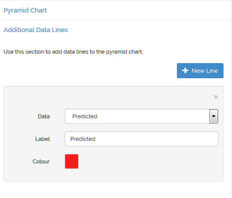
You can only show additional data lines if you have data for all available indicators.
Try it yourself
You can have a look at this population pyramid demo, then go into edit mode, save a copy of it using ![]() and see how the data setup and configuration works.
and see how the data setup and configuration works.