The Area Profile layout is best suited to display the difference between the indicator values and the values of the comparison areas. In addition to the most common widgets, it contains an Area Profile widget as shown in the image below.
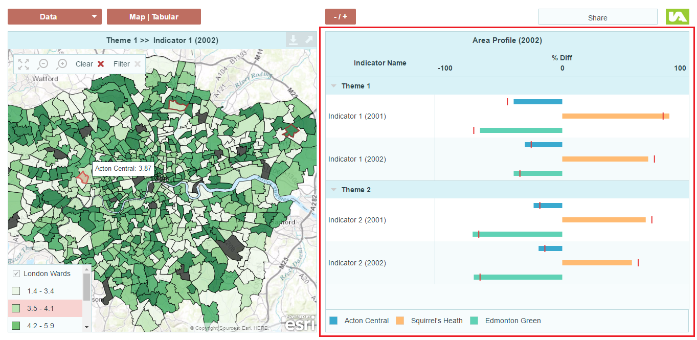
This widget looks and behaves like a table but it has a spine chart in one of its table columns. The horizontal bars to either side of the central spine show whether indicator values for the selected area(s) are above/below a given comparison value.
Click here to see a demo dashboard using an Area Profile layout.
Click here to see this demo dashboard in the edit mode.
Here are the steps to create a dashboard using Area Profile layout as shown in the demo dashboard.
- Applying the Area Profile layout
- Data Preparation
- Setting up dashboard Data Model
- Configuring the Area Profile widget
Applying the Area Profile layout
1. In the Dashboard Editor, select Layout in the top menu.
2. Under Profiling Areas section, hover over the Area Profile layout and then click Apply.
3. In the Continue? dialog, click Yes.
Note: Any changes to widget properties (including table columns) will be lost if you apply a new layout.
Data Preparation
The spine chart in the demo dashboard shows the difference between the indicator values of London wards and the values of the London average (comparator). The difference values are included in the source table as individual columns for each of the indicators as shown in the image below.
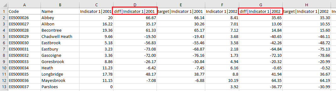
The percentage difference can be calculated in the following way:
100 * ((base area indicator value – comparator value) / comparator value)
This will give you positive difference values where the base area value is higher than the comparator value and negative difference values where the base area value is lower than the comparator value.
If your data includes target values they can be depicted as vertical markers superimposed on the horizontal bars on the spine chart. Your audience will be able to identify easily whether the target for a particular indicator has been reached or not.
Once the data source table is uploaded in the Dashboard Builder account and added to the dashboard, the next step is to structure the appropriate data model for the dashboard.
Setting Up the Data Model in the Data Manager
In this demo dashboard, the horizontal bar in spine chart is configured to display the associate diff value. To do so, each of the difference value columns in the CSV is set up as an associate for each of the indicators in the data manager’s data model panel as shown in the image below. Note that they must use the same associate name to be grouped together. In the example below diff is used as the associate name.
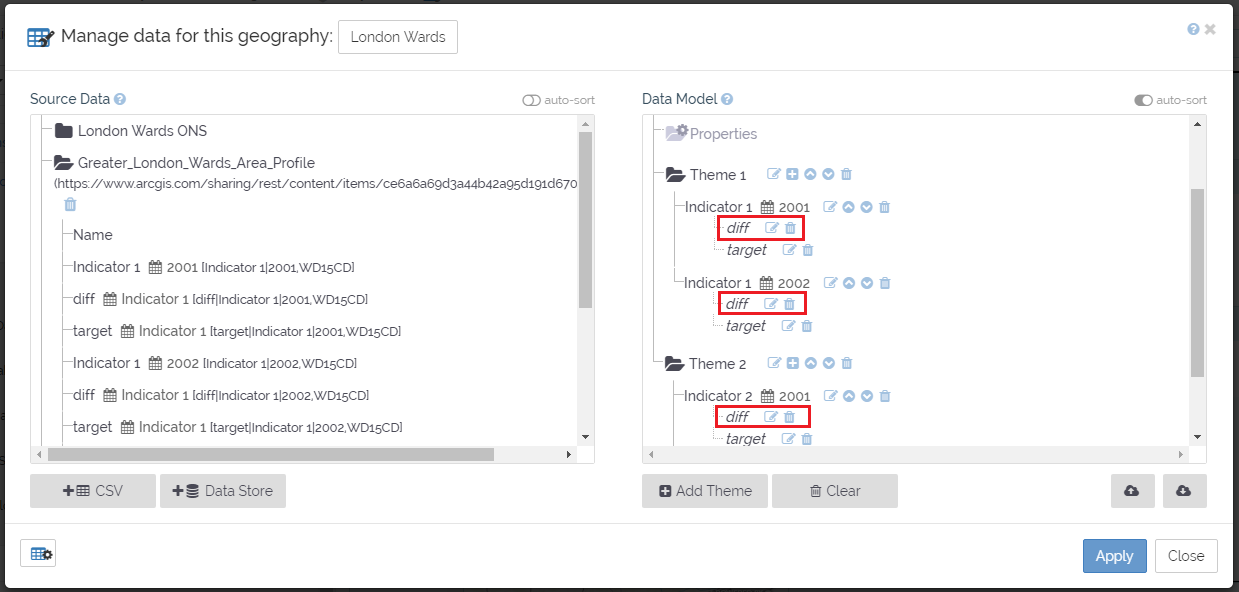
Each of the target value columns is also required to be set up as an associate in the same way as the difference value columns. In this example the associate is named as target.
Configuring the Area Profile widget
Specify data source
Once the data model is set up properly in the data manager, the Area Profile widget can now be configured to display the data, in this demo dashboard it is the diff associate.
1. Select the Area Profile widget. Its Properties panel should appear on the left.
2. Click Columns to expand the section.
3. Locate the column box for the spine chart. It looks like the image below.

4. In the Column Values section, set the minimum and maximum values for the spine chart.
5. In the Bar section, specify the associate diff in the Data Source box.
![]() You can set the colour of the horizontal in the Colour box but this will be overridden by the Selected Features Legend‘s colour scheme if this widget is included.
You can set the colour of the horizontal in the Colour box but this will be overridden by the Selected Features Legend‘s colour scheme if this widget is included.
Setting Targets
If you wish to show additional values on the spine chart in conjunction with the horizontal bars you can do so by inserting targets as shown in the image below.
To insert a vertical marker of an associate/indicator value, follow the steps below.
1. Click Chart Column Targets to expand the section.
2. Click New Target ![]() .
.
3. In the new target box, in the Data box, specify the data source for this target, in this demo dashboard it is the associate target.
4. Rename the label in the Label box. The text here will be used as the tooltip.
5. Select a shape for the vertical marker in the Shape box.
6. Change the size and colour in the Size and Colour fields.