As its name suggests, the Performance Profile layout is best suited to display performance indicators but can also be applied more widely to other data. In addition to the most common widgets, it contains a Performance Profile widget as shown in the image below.
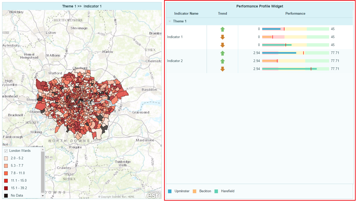
This widget looks and behaves like a table but it has a performance profile chart in one of its table columns. Each indicator value is represented by a symbol (horizontal bar by default) that is superimposed upon reversible colour ranges. Each range can be depicted as a performance category. Your audience can then easily tell which category each indicator is fallen into.
Click here to see a demo dashboard using a Performance Profile layout to show the indicator values.
Click here to see this demo dashboard in the edit mode.
Here are the steps to create a dashboard using Performance Profile layout as shown in the demo dashboard.
Applying the Performance Profile layout
1. In the Dashboard Editor, select Layout in the top menu.
2. Under Profiling Areas section, hover over the Performance Profile layout and then click Apply.
3. In the Continue? dialog, click Yes.
Note: Any changes to widget properties (including table columns) will be lost if you apply a new layout.
Data Preparation
The horizontal bar in the performance profile chart in this demo dashboard uses indicator value as its source data, and you can see that the associated CSV file contains columns of indicator values as shown below.

Here two additional columns for each indicator have also been added. The trend values, “+” and “-“, will be used to display the symbols in the chart’s Trend column and the target values will be depicted as vertical markers superimposed on the horizontal bars on the performance profile chart. Your audience will be able to easily identify the data trend and whether the target for a particular indicator has been reached or not. Note that these features are optional.
Setting Up the Data Model in the Data Manager
By default the horizontal bar in the performance profile chart is configured to display the indicator value, therefore this layout only requires the indicators to be set up in the Data Manager’s data model structure.
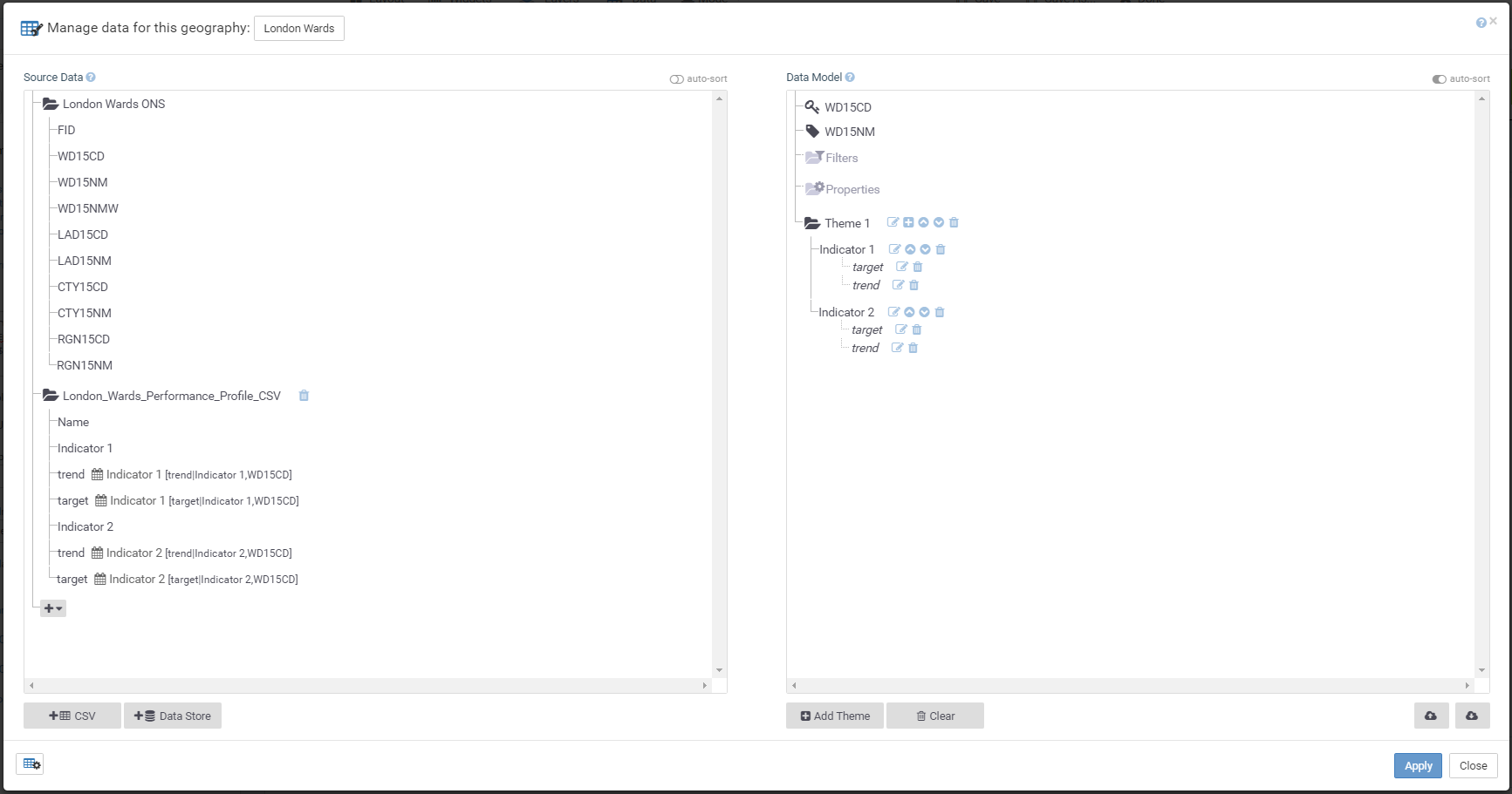
In this demo dashboard two associates have been created and will be used to display additional features. The target columns are specified as associate target to be displayed as red vertical markers and the trend columns are set up as associate trend for the arrow symbols in the performance profile chart’s Trend column.
Configuring the Performance Profile widget
Specify data source
By default the performance profile chart is using the indicator value as source data, but you can specify an associate as the source data instead.
1. Select the Performance Profile widget. Its Properties panel should appear on the left.
2. Click Columns to expand the section.
3. Locate the column box for the performance profile chart. It looks like the image below.
4. In the Bar section, in the Data Source box, specify a field from the list. In this demo dashboard it is the Indicator value.
Specify breaks for the colour ranges
By default, the breaks for the three individual colour ranges are automatically calculated depending on the values of each of the indicators. However, you can specify custom breaks following the steps below.
1. Click Chart Column Breaks to expand the section.
2. Click Add Custom Indicator Breaks.
3. In the Indicator Breaks dialog, in the Breaks column, specify the breaks for each indicator separated by a comma. E.g. 0, 15, 30, 45. You can specify the breaks in the grey Theme row, then click Copy to copy the values to all indicators within this theme.
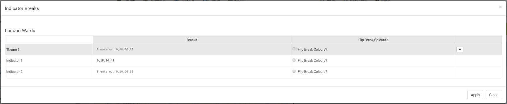
4. Click Apply.
Specify colours for the colour ranges
By default, there are three colour ranges for each indicator in the performance profile chart corresponding to the automatically calculated breaks. You can specify the interval label and colour in the Chart Column Breaks section. If custom breaks are specified, the number of colour ranges should correspond to the number of intervals in the custom breaks. For example, custom breaks of 0,10,20,30,40 will have 4 intervals and hence 4 colour ranges set.
1. To add a new colour range, click New Break ![]() in the Chart Column Breaks section.
in the Chart Column Breaks section.
2. In the new break box, specify the Label and Colour for the interval.
Adding Targets
The Performance Profile widget allows you to add symbols on performance profile chart to denote target values of the specific indicators as shown in the image below.
To insert a vertical marker of an associate/indicator value, follow the steps below.
1. Click Chart Column Targets to expand the section.
2. Click New Target ![]() .
.
3. In the new target box, in the Data box, specify the data source for this target, in this demo dashboard it is the associate target.
4. Rename the label in the Label box. The text here will be used as the tooltip.
5. Select a shape for the vertical marker in the Shape box.
6. Change the size and colour in the Size and Colour fields.
Adding Symbols
One of the capabilities of the Performance Profile widget is to replace data values with symbols in the data columns as shown in the image below.
Here the column Trend is displaying the values of associate trend as arrow symbols, ![]() for “+” and
for “+” and ![]() for “-“.
for “-“.
1. To set it up, first add a new column in the performance profile widget. Click Columns to expand the section.
2. Click Add New Column ![]() .
.
3. In the new column box, specify the Symbol Source from the list of indicator/associates. In this demo dashboard, the associate trend is used.
4. Now click Symbols to expand the section.
5. You can either click Add New Symbol ![]() to add a new symbol or replace the values in existing symbol boxes which are not relevant. In the demo dashboard, two symbol boxes are required, one to set an Up arrow for the value “+” and the other to set up the Down arrow for the value “-“.
to add a new symbol or replace the values in existing symbol boxes which are not relevant. In the demo dashboard, two symbol boxes are required, one to set an Up arrow for the value “+” and the other to set up the Down arrow for the value “-“.
6. In one of the two symbol boxes, specify “+” in the Data Value box.
7. In the Shape box, select the arrow up from the list. Also specify the Label, Size and Colour as desired.
8. In the other symbol box, specify “-” in the Data Value box and arrow down in the Shape box.
9. Specify the Label, Size and Colour as desired for the down arrow.
Now you should see the column Trend will display the symbols as configured in the Columns and Symbols section.