The Health Profile layout is designed to show indicator values in comparison to benchmark values. This layout is particular popular amongst health professionals. In addition to the most common widgets, it contains a Health Profile and Health Profile Legend widgets as shown in the image below.
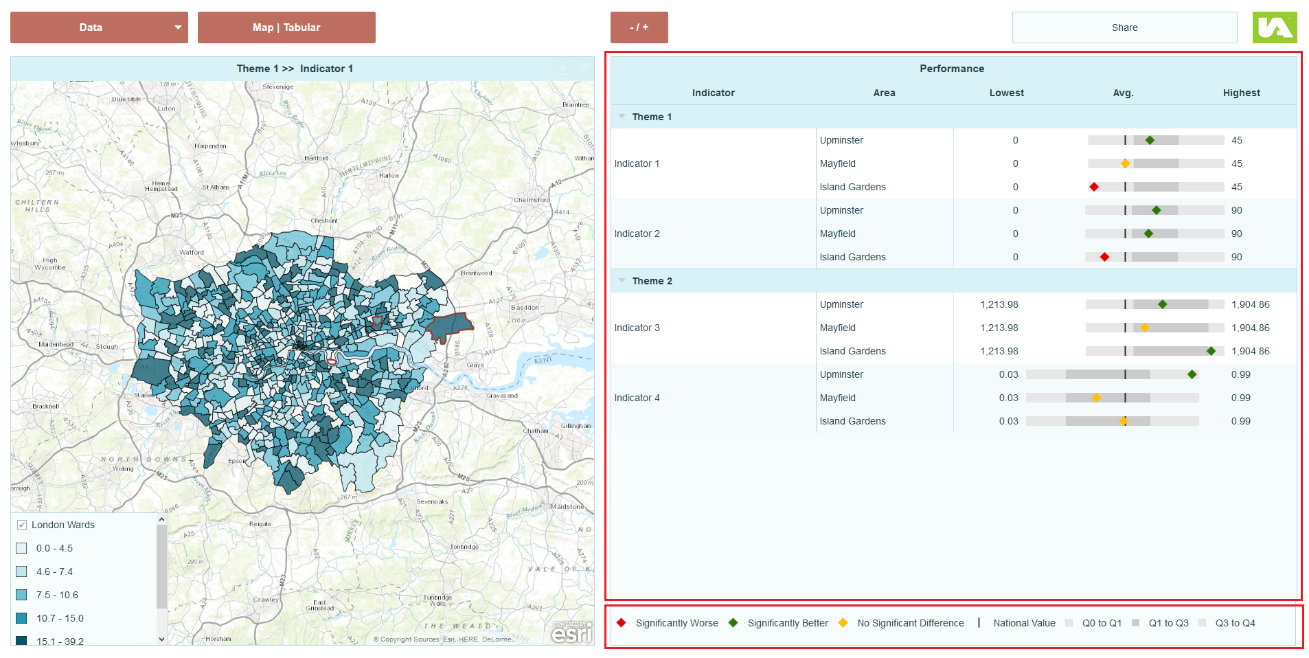
The Health Profile widget looks and behave like a data table but it has a spine chart in one of its columns. Here the indicator value is represented by a coloured symbol, with its colour representing its statistical significance. The indicator symbol resides on top of colour ranges which are centred around a median value or specified benchmark value, such as the national average.
Click here to see a demo dashboard using a Health Profile layout.
Click here to see this demo dashboard in the edit mode.
Here are the steps to create a dashboard using Health Profile layout as shown in the demo dashboard.
Applying the Health Profile layout
1. In the Dashboard Editor, select Layout in the top menu.
2. Under Profiling Areas section, hover over the Health Profile layout and then click Apply.
3. In the Continue? dialog, click Yes.
Note: Any changes to widget properties (including table columns) will be lost if you apply a new layout.
Data Preparation
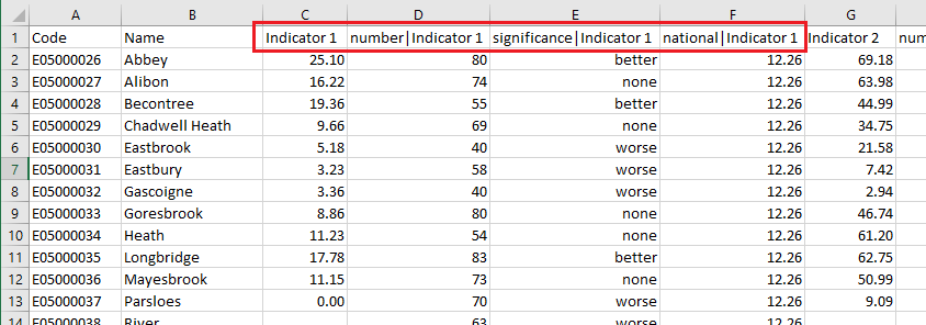
In order for the health profile chart to work as shown in the demo dashboard, the source table must contain a respective column for the indicator values, the benchmark values and the significance symbols values. Here the indicator value is used to define the position of the coloured area symbol on the health profile chart; the national value (benchmark value) is used to centre the background coloured bar and the values in the column significance are used to link the area symbols set in the health profile chart. For example, the value ‘worse’ in the significance column will be replaced by a red diamond symbol on the chart. A snapshot of the CSV file is shown as below.
Setting Up the Data Model in the Data Manager
The required data model in the demo dashboard’s data manager is shown as below.
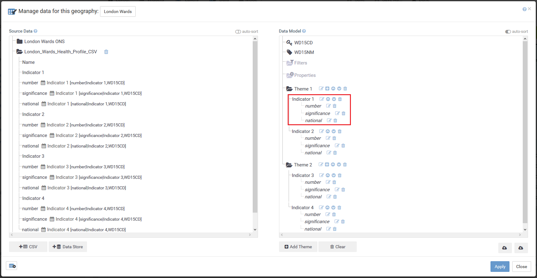
Note that the national value column and the significance symbol column must be set as associates of the indicator values. The associates are named as national and significance in this demo dashboard.
Configuring the Health Profile widget
The Health Profile widget can be configured after the data model has been structured in the data manager.
Specify Position, Symbol and Centre Value sources
1. Select the Health Profile widget. Its Properties panel should appear on the left.
2. Click Columns to expand the section.
3. Locate the column box for the health profile chart. It looks like the image below.

4. In the Area Symbol section, in the Position Source box, specify Indicator value.
5. In the Symbol Source box, specify the associate used to display the significance symbols. Here it is the associate significance. Note that the colour of the symbols will remain grey (default colour) until the appropriate symbols are added in the Symbols section.
6. In the Centre Value box, specify the associate for the benchmark values, in this demo dashboard it’s the associate national.
7. The left, centre and right label names for the column can also be set in the Column Labels section here.
Specify Breaks for the Colour Ranges
By default, the breaks for the three individual colour ranges are automatically calculated for each indicator as quartiles. However, you can specify custom breaks following the steps below.
1. Click Chart Column Breaks to expand the section.
2. Click Add Custom Indicator Breaks.
3. In the Indicator Breaks dialog, in the Breaks column, specify the breaks for each indicator separated by a comma. E.g. 0, 15, 30, 45. You can specify the breaks in the grey theme row, then click Copy to copy the values to all indicators within this theme.
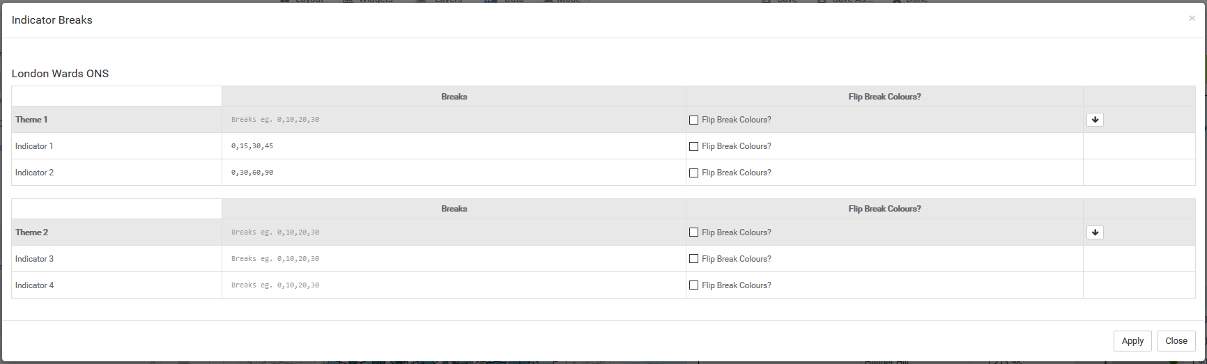
4. Click Apply.
Specify Colours for the Colour Ranges
By default, there are three colour ranges for each indicator in the health profile chart corresponding to the automatically calculated breaks. You can specify the interval label and colour in the Chart Column Breaks section. If custom breaks are specified, the number of colour ranges should correspond to the number of intervals in the custom breaks. For example, custom breaks of 0,10,20,30,40 will have 4 intervals and hence 4 colour ranges set.
1. To add a new colour range, click New Break ![]() in the Chart Column Breaks section.
in the Chart Column Breaks section.
2. 2. In the new break box, specify the Label and Colour for the interval.
Specify Symbols for the Symbol Source field
When the Symbol Source box is set in the Columns > Area Symbol section, the health profile chart will use the values from the data source field, in this demo dashboard the associate significance values, to find a matching symbol from the Symbols section to be displayed as the area symbol.
1. Click Symbols to expand the section. Here the significance associate is made up with three different values, ‘worse’, ’better’ and ‘none’. In the Symbols section a separate symbol is created for each of the data values. Red diamond for the value ‘worse’ (see image below), green diamond for the value ‘better’ and yellow diamond for the value ‘none’.
2. To add a new symbol, click New Symbol.
3. Specify the Data Value, Label, Shape, Size and Colour fields.
Adding Targets
The Health Profile widget also allows you to add symbols on the chart to denote target values of the specific indicators although this is not demonstrated in this demo dashboard.
To insert a vertical marker of an associate/indicator value, follow the steps below.
1. Click Chart Column Targets to expand the section.
2. Click New Target ![]() .
.
3. In the new target box, in the Data box, specify the data source for this target (e.g. associate target in the image below).
4. Rename the label in the Label box. The text here will be used as the tooltip.
5. Select a shape for the vertical marker in the Shape box.
6. Change the size and colour in the Size and Colour fields.